Our team of two designers and fifteen developers was developing a customer relationship management (CRM) platform for investor relations (IR). It allows investor relations officers to monitor all components of their IR program, which includes managing investments and company relationships with investors.
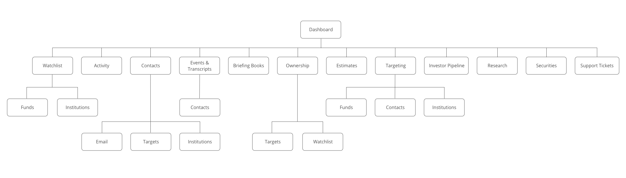
A CRM dedicated to investment management of publicly traded companies isn’t something that really existed prior to the creation of Q4 Desktop. Selecting features that were directly related to stock trading would be key, as well as creating a design that was not visually overwhelming but still allowed for easy navigation. The main features of the product are the ability to:
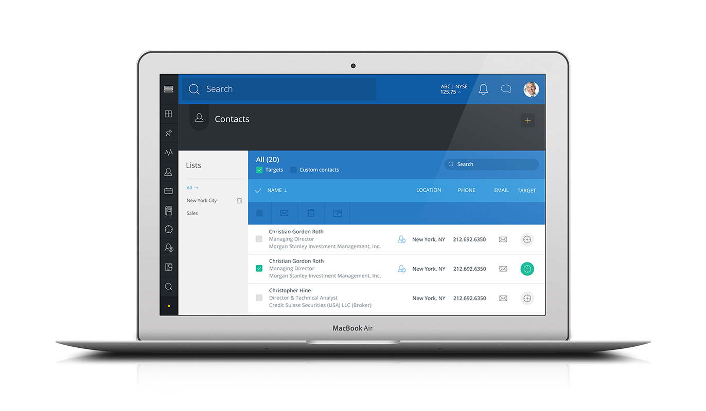
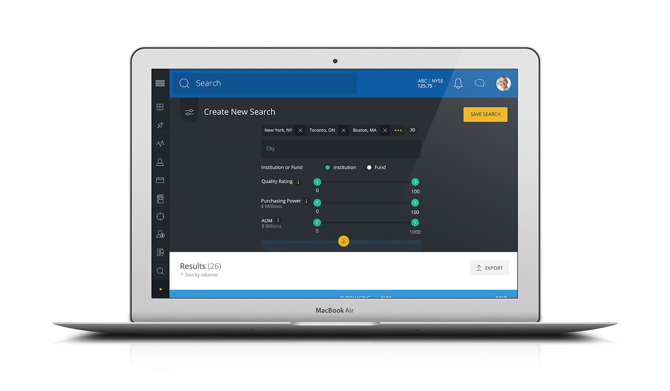
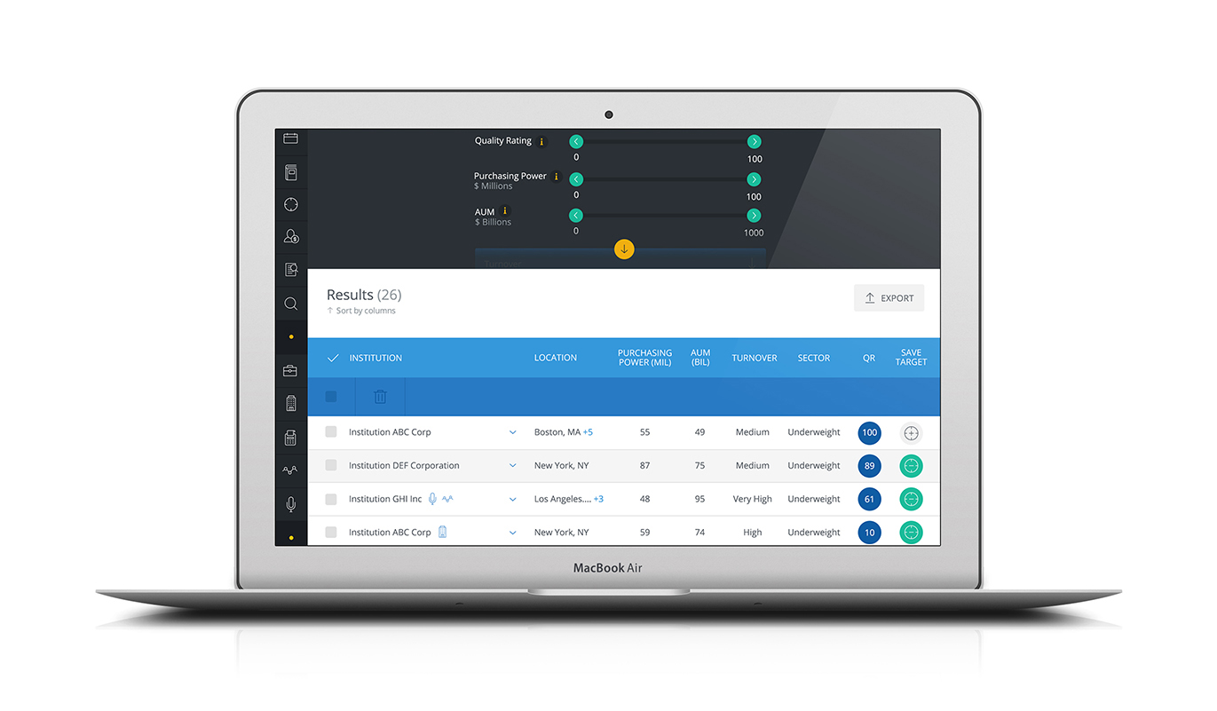
Manage all your contacts.
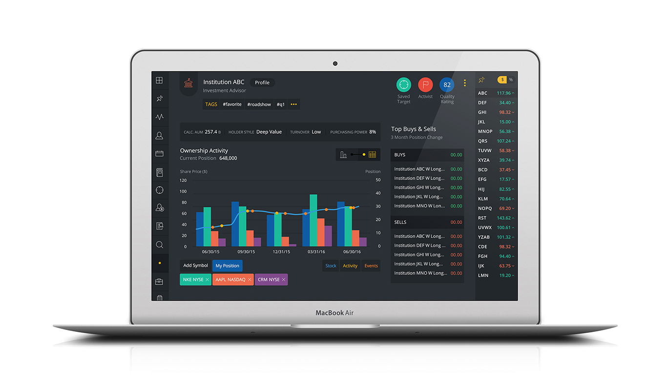
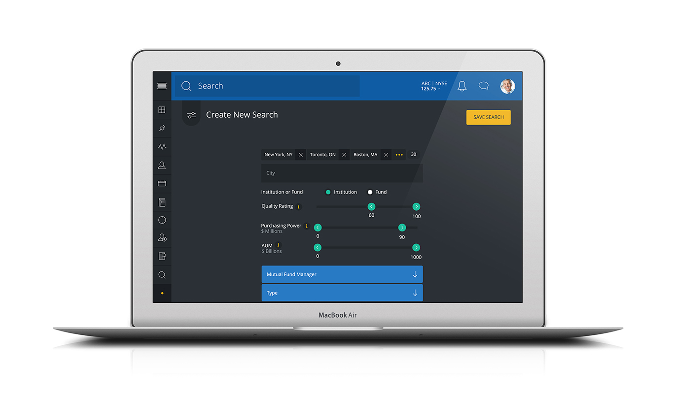
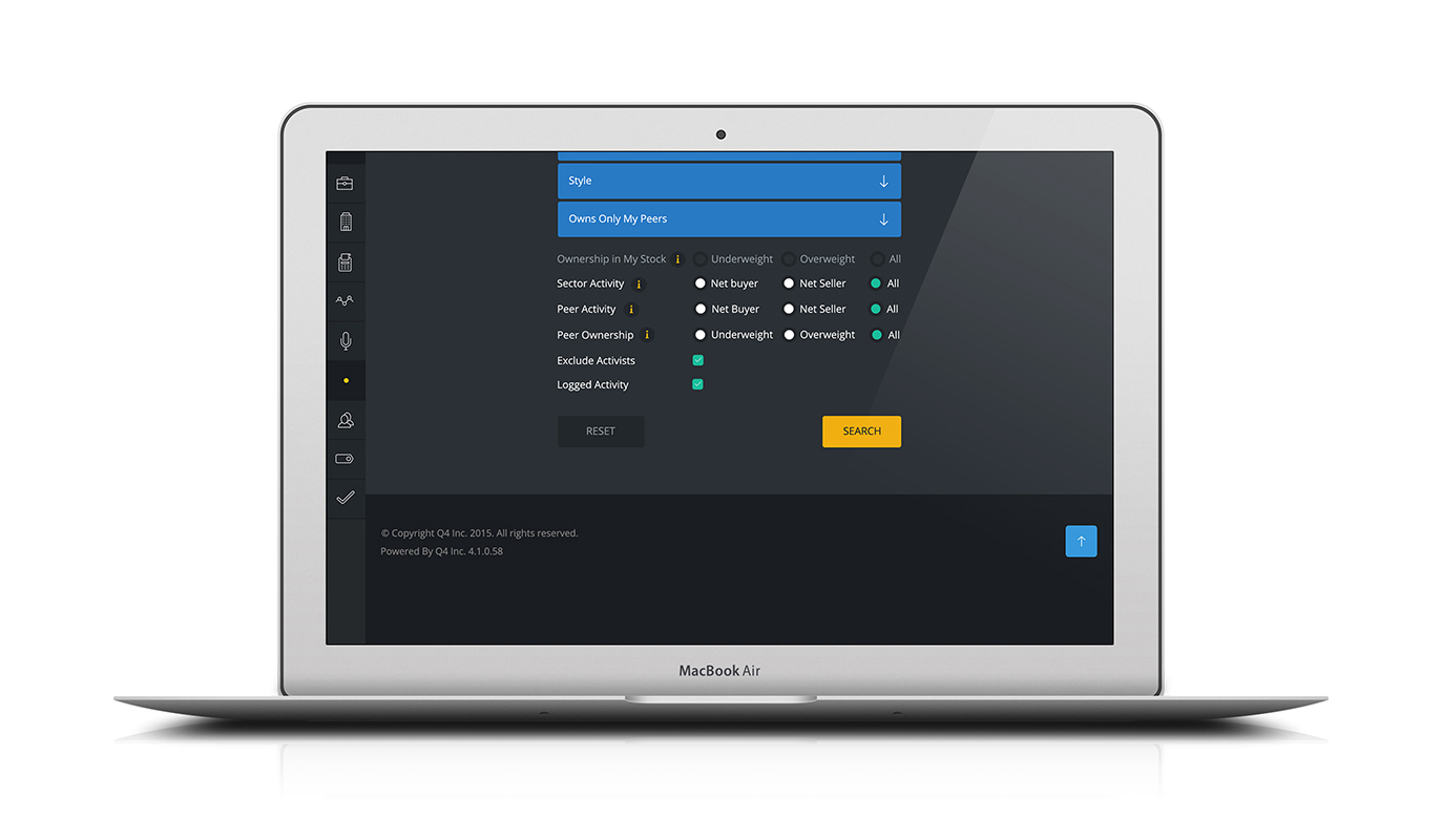
Track your targets via AI.
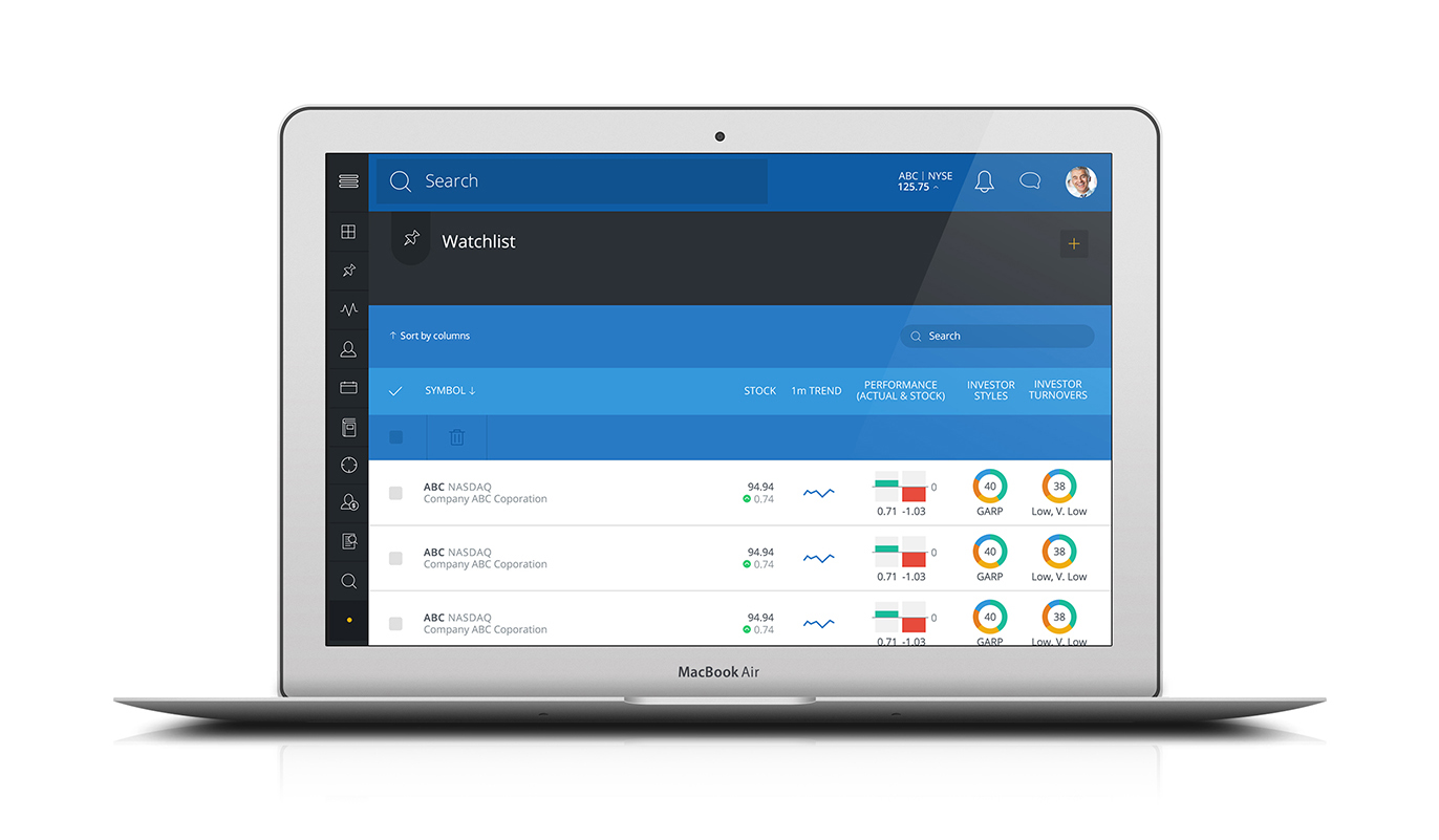
Develop a watchlist.
Get basic daily updates on your dashboard via AI.
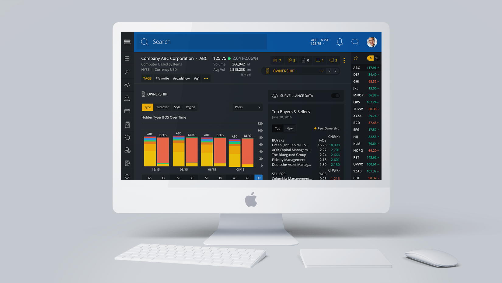
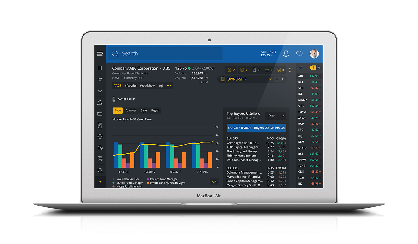
Enable users to see how their company’s stock is performing relative to the market, industry, and their peers.
My product manager and I found a small group of potential users who were willing to speak to be interviewed by us. Here is the summary of our research findings:
People in the finance industry are used to seeing a lot of information at once. They’re so familiar with visual clutter that they actually prefer having everything available at once.
Users wanted something that was easy and fast to get the information they needed and to move on with their day.
Users weren't used to a variety of data visualizations in their usual finanace products but they mentioned appreciating when the visualization made it easier to get the information they required as well as a "sleek" look.
For all sections of the application I created medium fidelity wireframes in UX Pin. I quickly found out that our stakeholders didn’t understand what they were looking at when they saw these wireframes, and from then on created high fidelity wireframes for all our features. The brand and skeleton of the product was created by my Creative Director, so those were parameters I had to work within when deciding how the product would work.
I used interactive charts as a way of not causing too much visual clutter. I also used other types of visualizations, like very smaller secondary graphs or icons that would be easily identifiable for users so that they could read smaller chunks of information.
The design system for Q4 Desktop wasn’t fleshed out when I began working on it, which led to some inconsistencies throughout the product. My Creative Director and I had to take a look at all the features that currently existed and decide on a more defined system before we moved forward. One major example of this is ways that the user could filter in tables and in graphs; it was somewhat inconsistent and required the team to get together to make corrections.
Users found the product easy to use and loved that it didn't require additional customization.
Users found the look of the product "sleek" and attractive.
Expanding the product proved difficult since its design system wasn’t as scalable as I would have liked it to be.
Accessibility was not strongly considered.