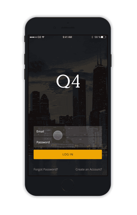
Our team of two designers and fifteen developers that created Q4 Desktop was also creating a mobile app version of the application. It’s important to note that this project was on a strict timeline as it was supposed to be presented at The National Investor Relations Institute (NIRI) within three months.
Our users expressed a strong desire to access Q4 Desktop on their mobile devices for greater flexibility outside the office. However, the platform's complexity presented significant challenges in directly translating it into Android and iOS versions. To address this, we carefully prioritized and streamlined the features and functionality, ensuring a user-friendly and effective mobile experience.
A year before initiating this project, the company attempted to develop Q4 Touch alongside Q4 Desktop but faced challenges due to a lack of clarity on which features were most relevant to users. To ensure a more focused approach this time, my product manager and I conducted a comprehensive survey of existing Q4 Desktop customers to identify the features they most frequently use outside the office.
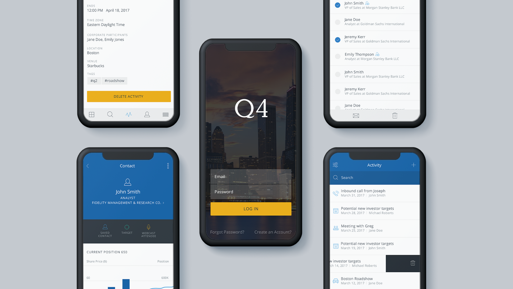
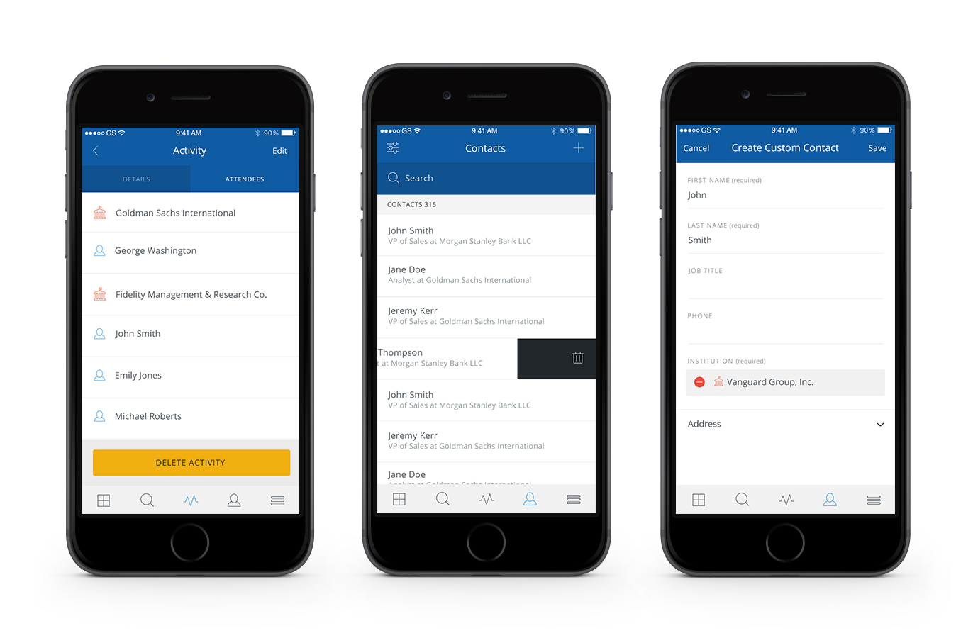
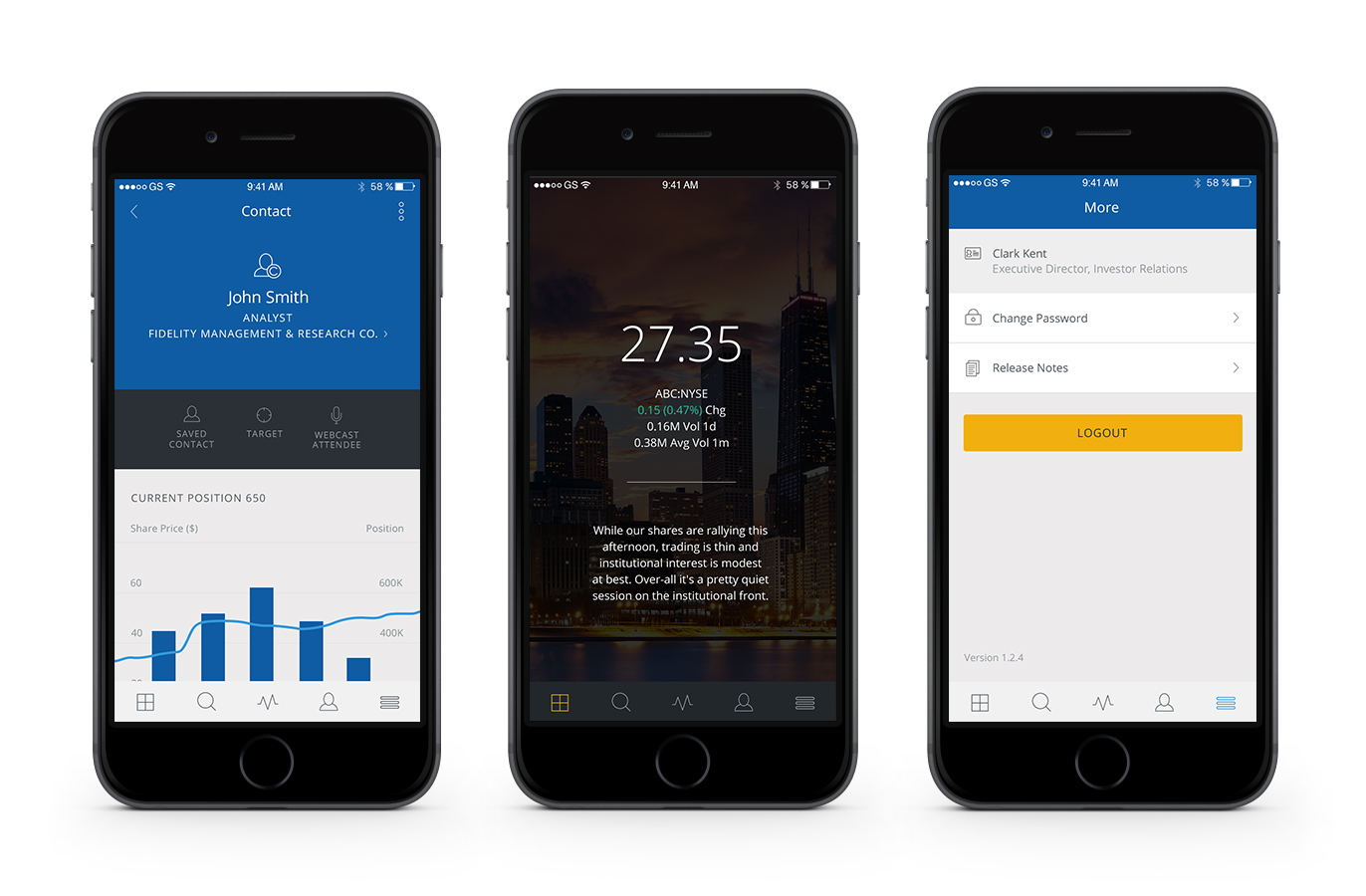
Users must be able to view detailed information for institutions, funds, and contacts.
Users must be able to search for all available institutions, funds, and contacts.
Users must be able to add existing contacts and create new contacts.
Users must be able to create roadshows and take notes.
Users must be able to view their usual AI based dashboard summary.

My wireframes were mainly to explore different forms of navigation and how to display any fund or institutional data. I explored a few different forms of app navigation and settled on a typical navigation bar at the bottom of the screen. It allowed for easy access to all our features, and this application wasn’t intended to be very large or have that many different sections, so I didn’t feel that would limit the future scale of the app.
These wireframes were also made high-fidelity so our developers could use them to see what direction I was going in. We were so pressed for time that we were developing and designing at the same time.
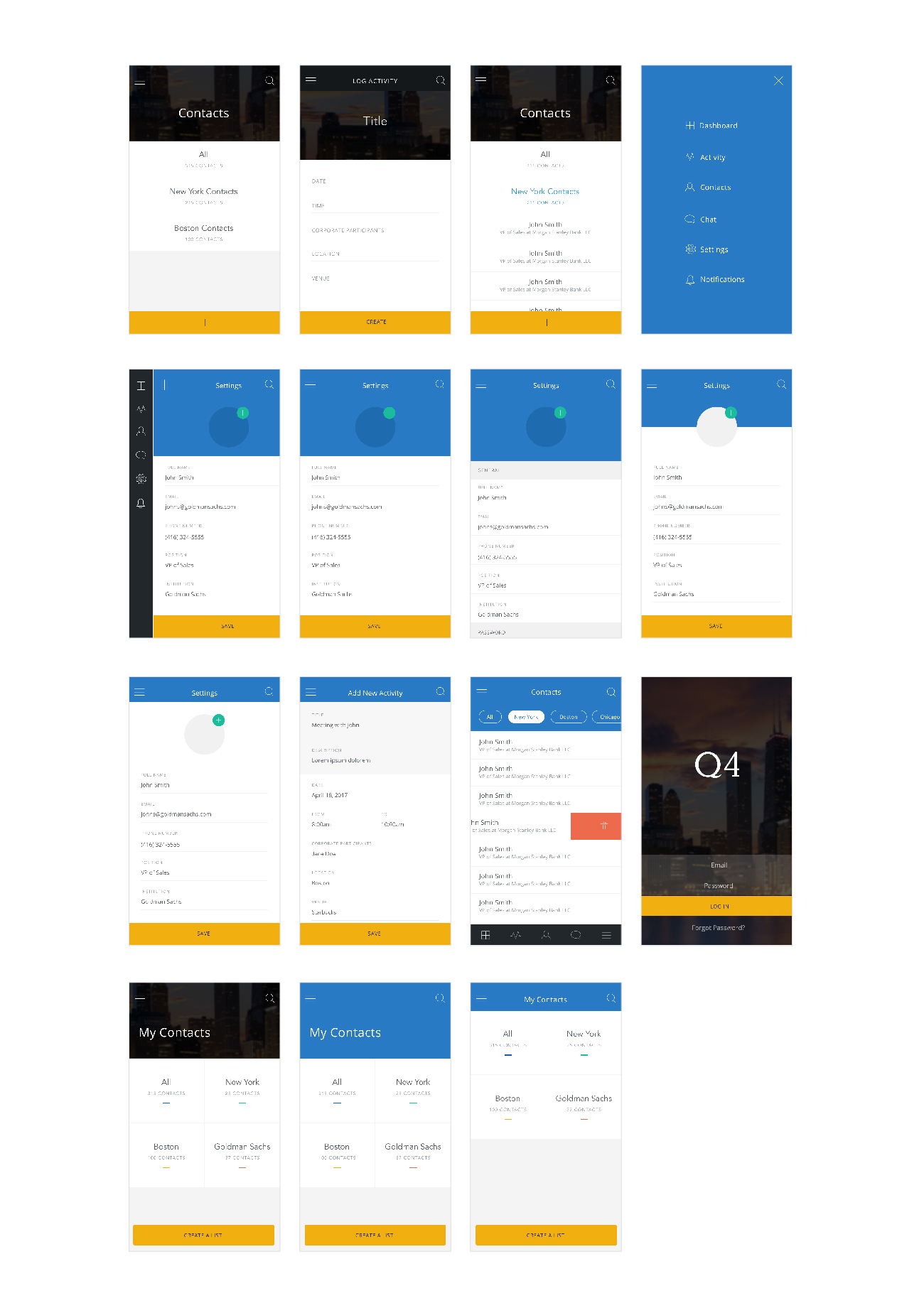
Creating the same look and feel as our desktop product on a phone app proved more difficult than I expected. Outside of text, the general colour palette, and button styles, there was no clear-cut answer as to what this app would look like.
I added an interaction that allowed users to scroll horizontally on the graph to see older data. This interaction is pretty important to the usability of the graph and I tested it with five of our customers in order to see if they realized it was there and knew how to use it. I released the current app to them via TestFlight in order to allow them to use the app for a few days. I then had a follow up call with them to get any feedback. Four out of five users were aware of the interaction and knew how to use it, which made me feel comfortable going forward with this solution.
Limiting the scope of our features for business purposes actually ended up making the app easier for our users to understand in this first release. There are many things I would go back and change if we had the time, the biggest being that accessibility was not strongly considered during this initial release due to time constraints. But accessibility is hugely important for any user base and it's something I think needs to be worked on as a fast follow.