I examined why and how women track their menstrual cycles in order to uncover any design solutions that may improve their tracking experience. From my research, I found that the most common way of tracking menstrual cycles was through phone apps. Through this I created Sync; a period app that’s inclusive for people of varying ages, sexualities, and those with reproductive and other health issues.
Overall, the variance in a woman’s experience with her cycle is not encompassed in the experience of using most tracking apps. I compared twelve of the most popular period apps and found that most of them had almost all of the following issues:
The app assumed through language and imagery that the user was heterosexual.
Most apps encouraged users to track their ovulation and pregnancy, which can be emotionally difficult for women with fertility issues. A few apps don't include pregnancy or fertility, which doesn’t work for those who want to be pregnant.
Most apps didn’t consider those suffering from health or reproductive diseases.
Many women feel that their period tracking app looks childish and overtly feminine, which makes it very clear to people around them that they’ve opened up a period app.
Companies are monetizing women’s extremely personal health data.

I began my research by analyzing the features and design of twelve of the most popular period apps. The issues found most frequently were:
That the apps had limited or no tracking of symptoms.
Limited or no concept of birth control (none had a concept of Plan B).
No statistics or reports for medical assistance.
Not inclusive of all sexualities.
They were too “girly” looking.
I conducted a competitive analysis to determine if any existing apps addressed women's concerns. I found only one app that partially addressed some issues, but most apps failed to meet women's needs.
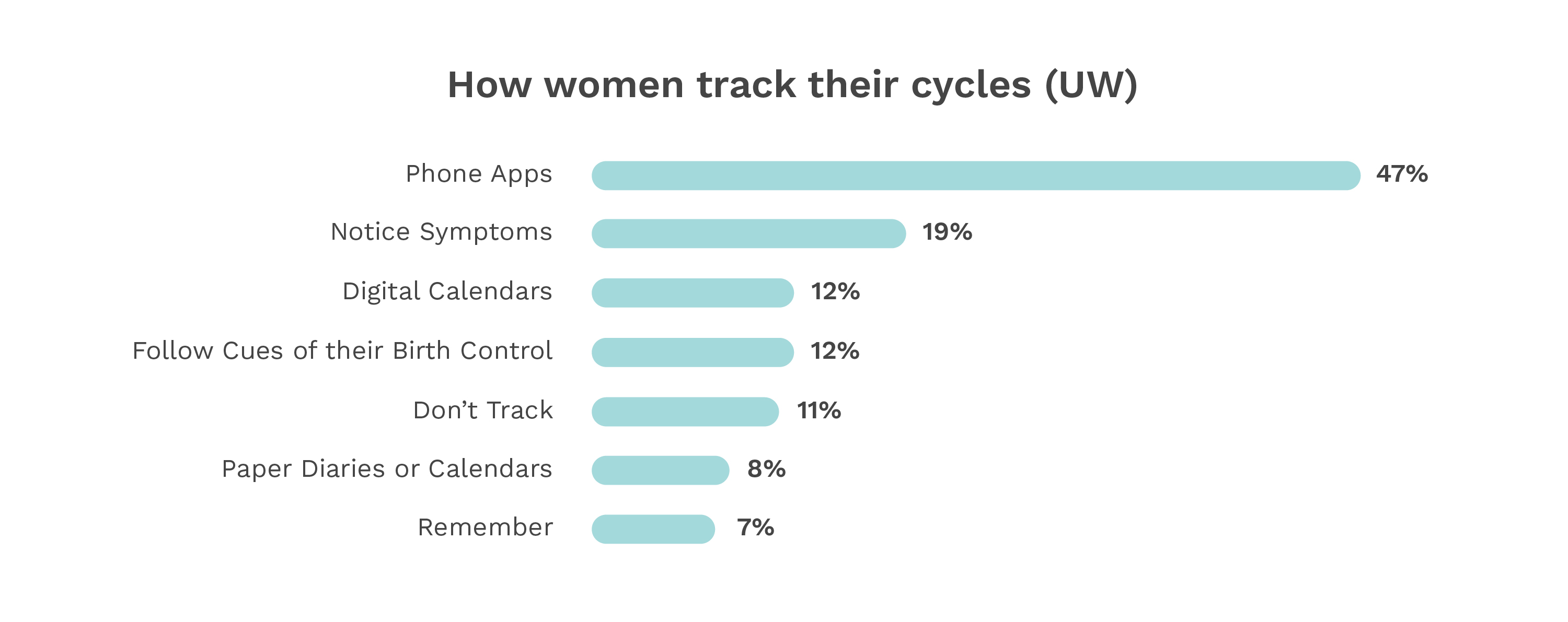
A study that was done on the same topic at the University of Washington found the most common reasons women tracked their cycle, as well as the most common forms of tracking.
58% of participants had a reproductive disease or disorder, and noted that they had issues tracking their cycle because they can’t track their symptoms.
Wouldn't track their irregular cycles correctly.
Limited how long their period should last (limited to 8 days or less).
Unnatractive UI.
Feeling alienated due to either not wanting to get pregnant or not being heterosexual.
51%
Tracked their cycle digitally
43%%
Used a period app
22%
Used their period app on at least a weekly basis
After the survey, I interviewed participants to explore their experiences further. They shared the apps and tracking methods they used, issues with each, and their overall impact. By the end, many common themes emerged.
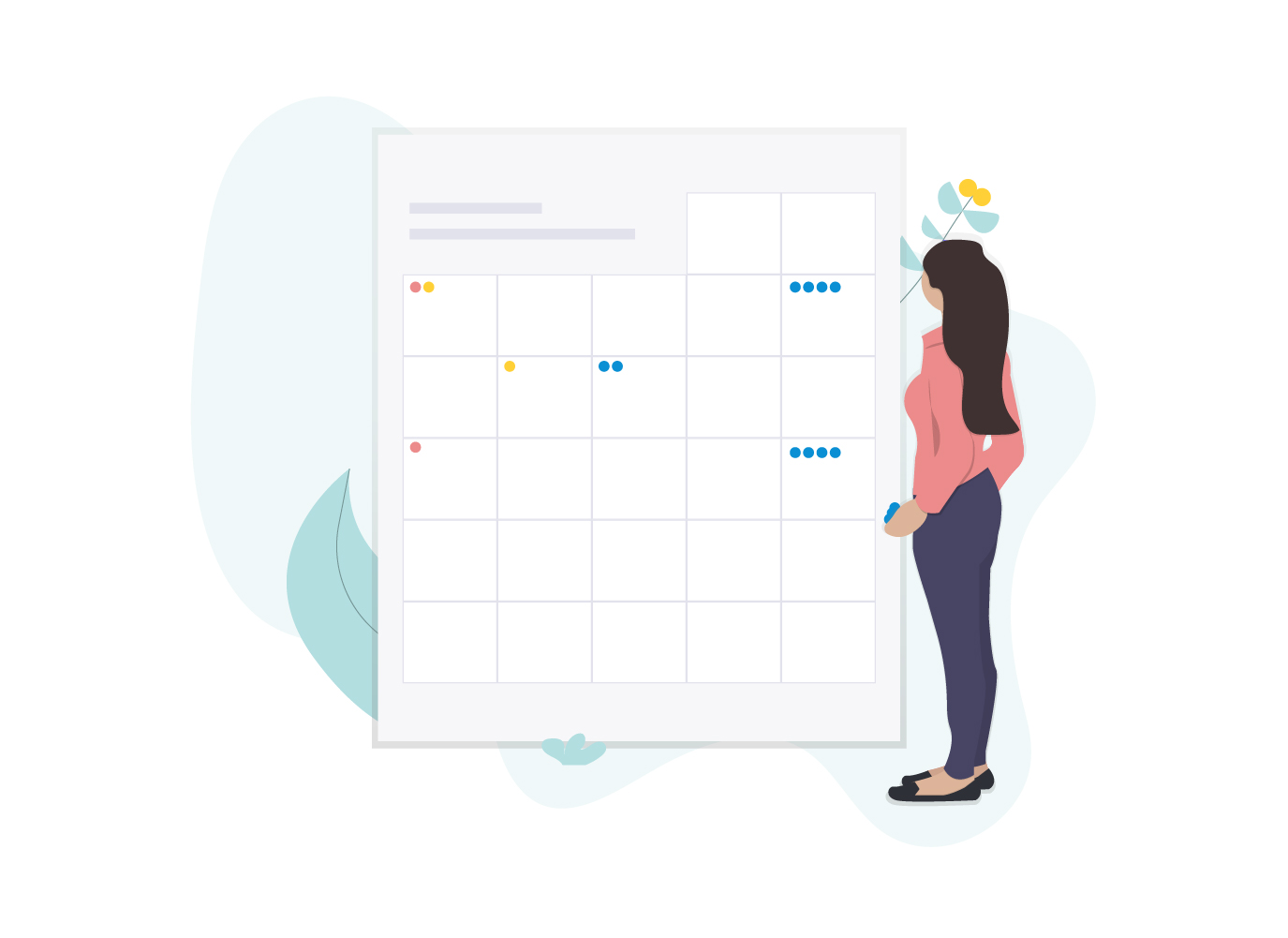
I created a list of features that the app should have based on the information I gathered. The point is to allow people to have everything they need but feel included and comfortable in their experience.
Track their cycles.
Track their symptoms.
Track their medication.
Write any personal notes.
See reports and insights on what they track.
Have a very customizable settings section to help them dictate their own experience.
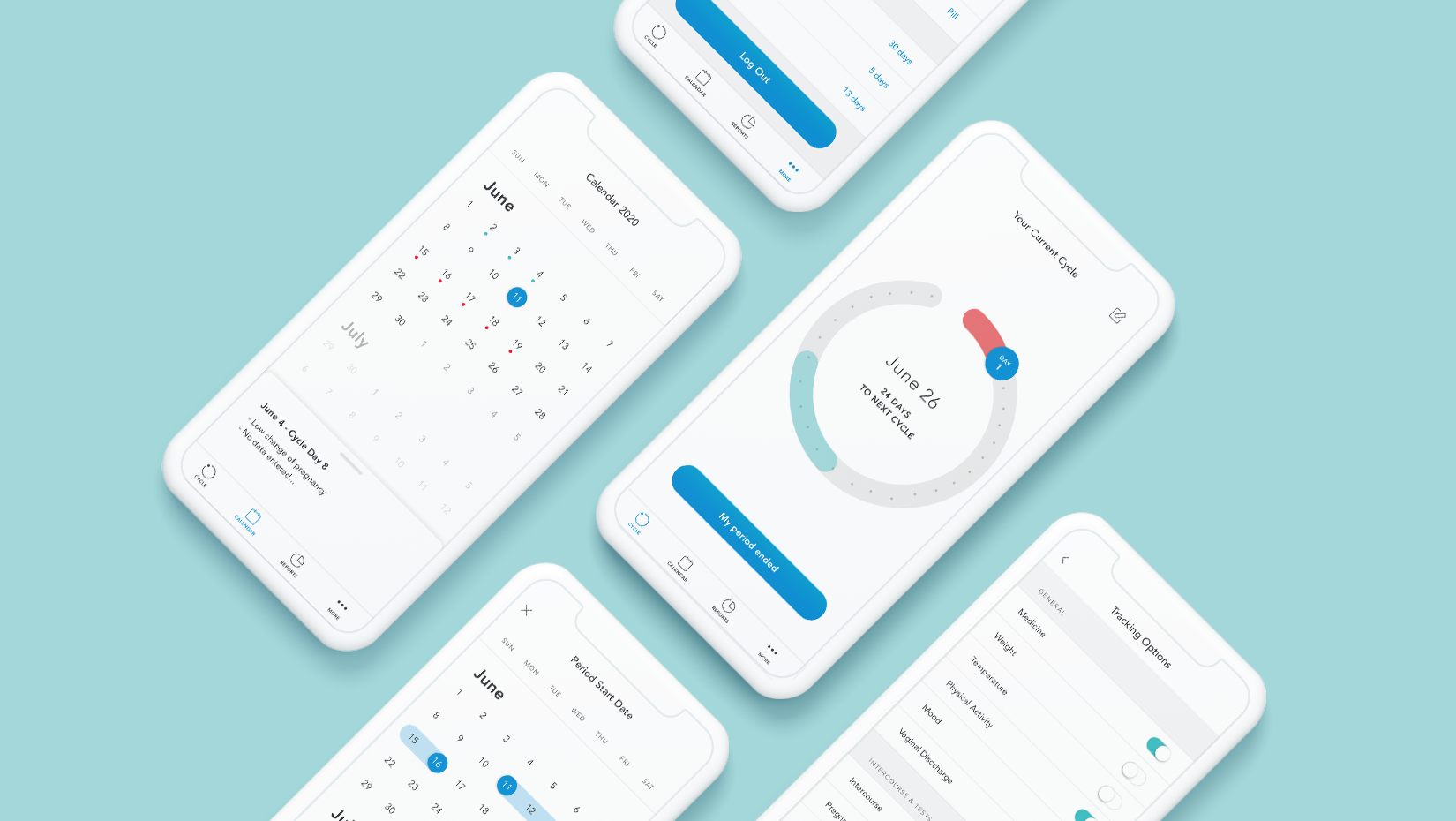
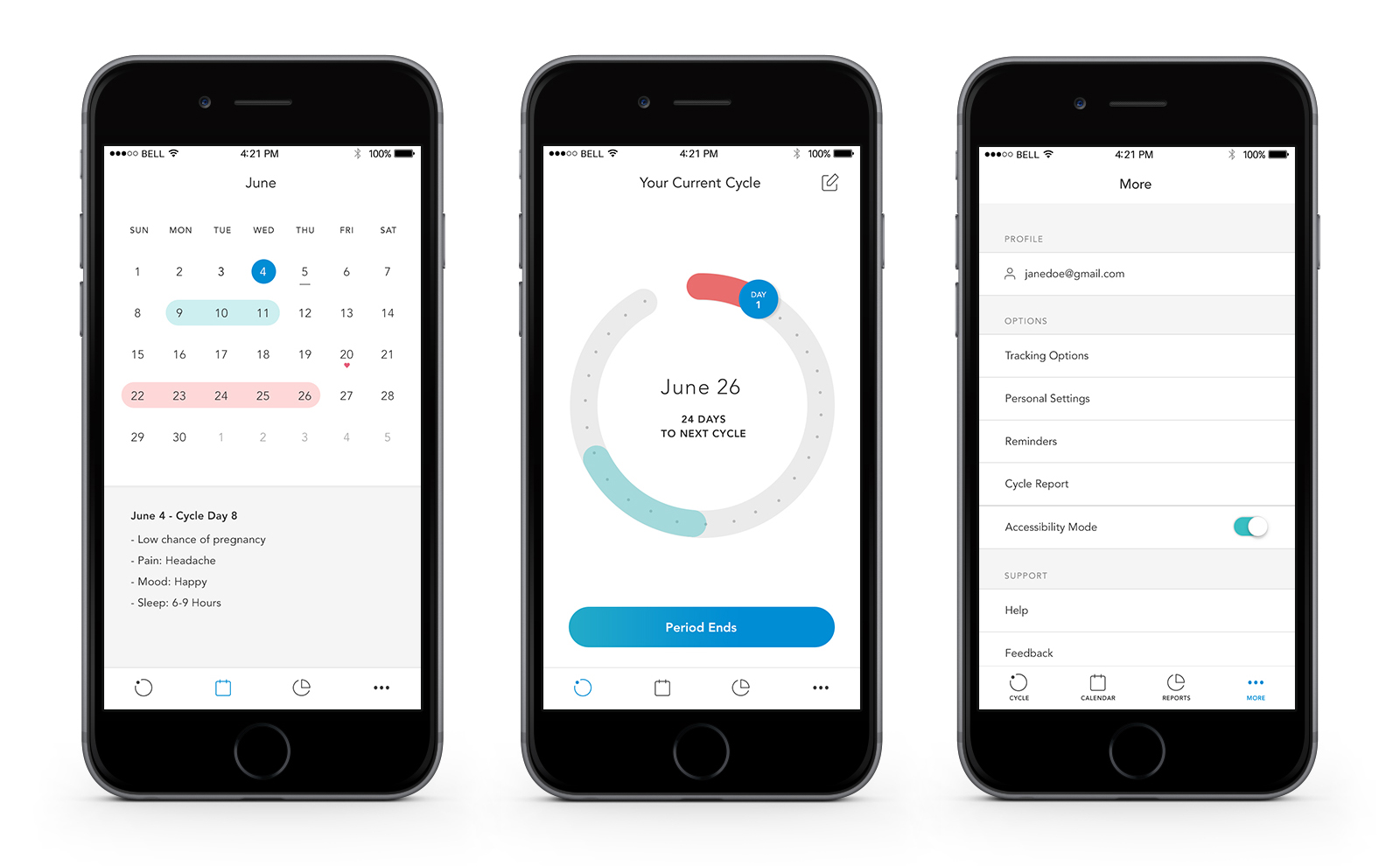
I then sketched out wireframes of all the major screens. I wanted to know what views a user would see when they were inputting information about their cycle. How many possibilities were there in how they can input that information?
The UI of this app was going to be very important since it’s something women specifically pointed out as an issue. I showed several potential users examples of colour combinations that the app could possibly have to find out what resonated with users most, since many were averse to pink, purple, and red.
I created an initial design that I felt for the most part fit what the users needed and adhered to ideas I had during the wireframing stage. However, upon further inspection and user testing some changes ended up being made.
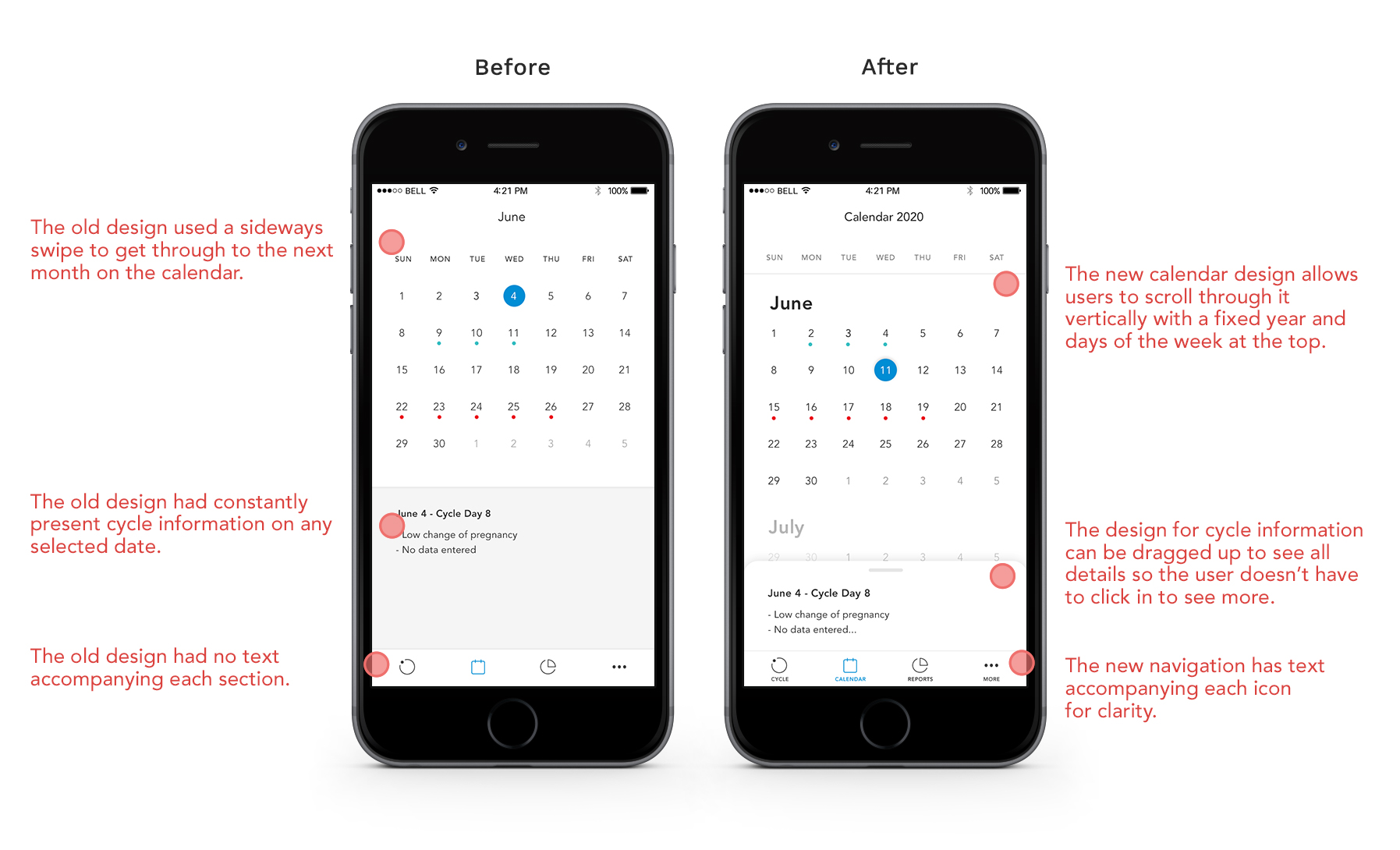
I changed the way the calendar functioned so that users would have access to more information if they needed it in the notes/tracking area.
I changed how users would scroll through the calendar, I have fixed the days of the week to the top and you can scroll vertically rather than clicking to the next month horizontally in the original design.
I added a ‘Today’ button which would help bring users back to whatever todays date is if they navigate away.
I altered the language to be more personal and conversational.

I did in person user tests and had each person walk through tasks that would take them through primary sections of the app. The women I tested with were very happy with the app as a whole but had some feedback.
Pain point #1: Some users were confused by the icons and suggested the use of different icons. I decided to add titles under the icons instead since this is a pretty standard way of solving that problem.
Pain point #2: A couple of users were drawn to buttons I didn’t want them to press based on the tasks I was giving them. They were drawn to them because of the colour, or because they were bolded.
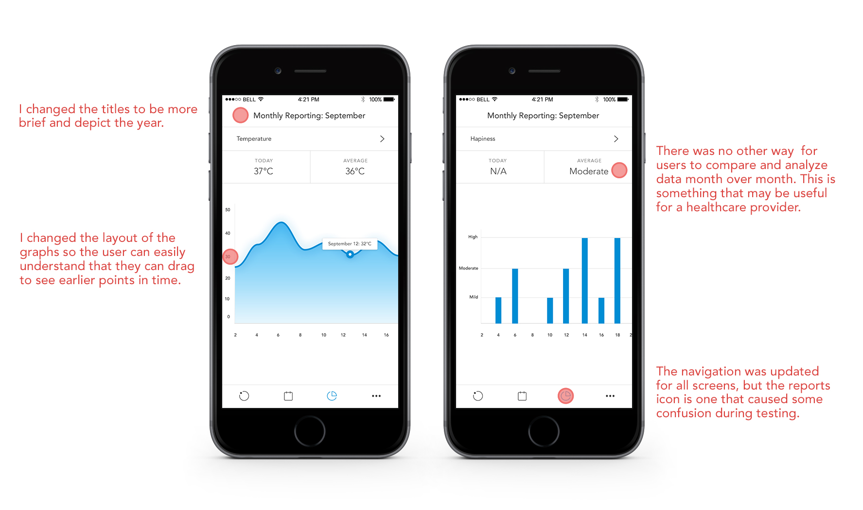
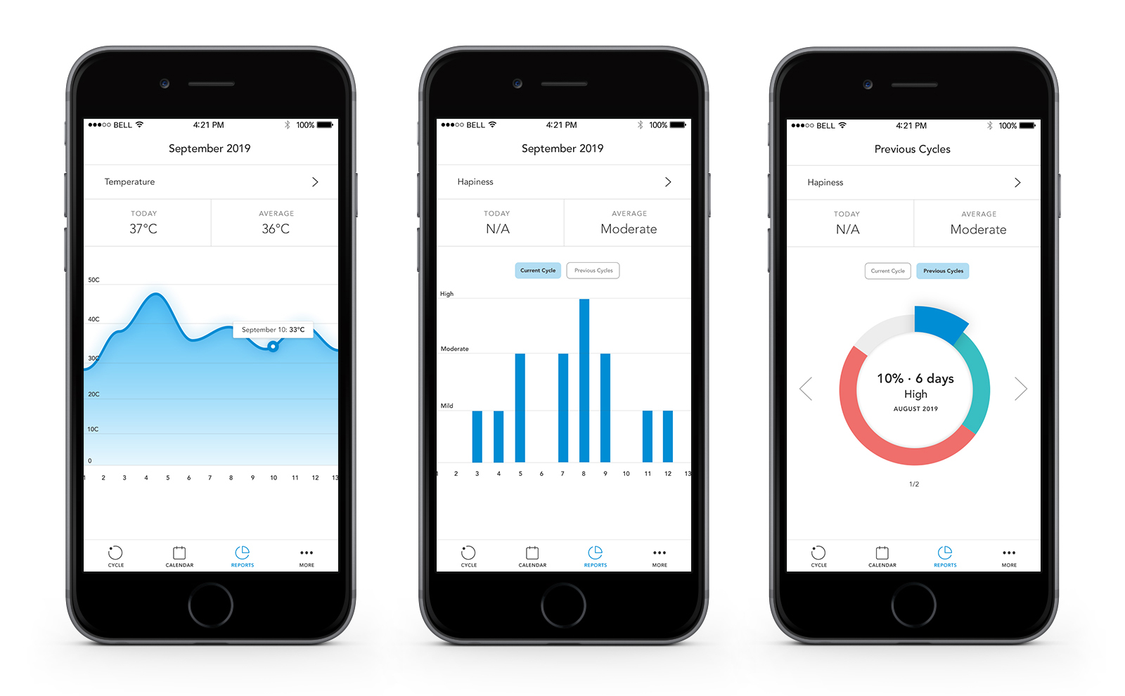
In the final high-fidelity mockups I made several changes according to the user testing, but I also took the opportunity to update the reporting to include more analysis. The previous reports didn’t give comparison points or insights which could be useful when speaking with their healthcare provider.
Learning about women's varied personal and medical experiences was very insightful and something not focused on enough in the medical field.
This was a great exercise in inclusivity through design.
I’d like the opportunity to test a functional prototype with a larger and more varied group of users so that I can ensure it is meeting the expectations I initially defined for the app.