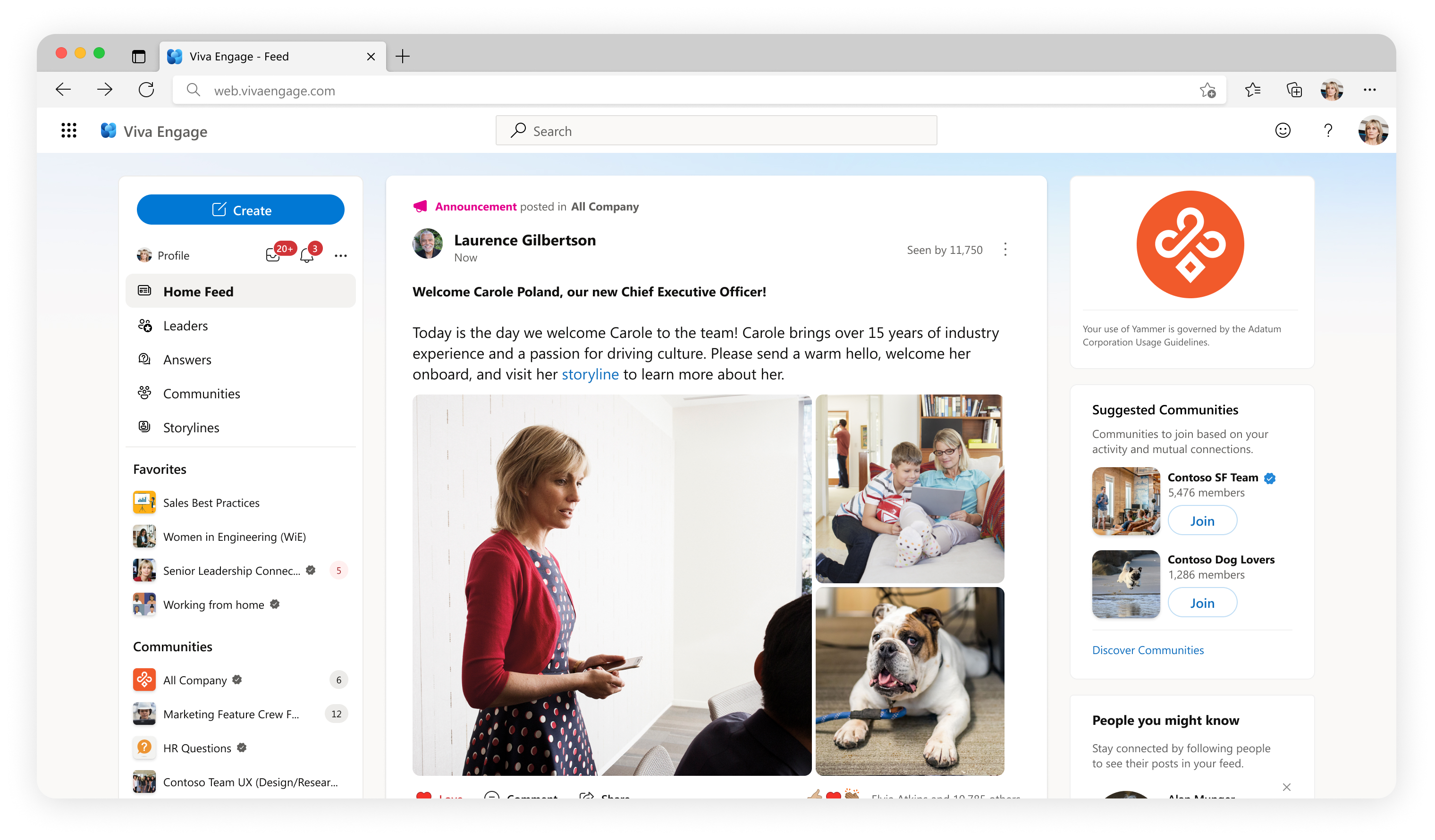
Viva Engage (formerly Yammer) is a platform that connects leaders, communicators, and employees to build communities within organizations. The publisher component is used for creating posts. With the shift from Yammer to Viva Engage, we redesigned the publisher to enhance the existing design system and create a more scalable solution for future features. This redesign is meant to improve the existing design system used for the publisher and to create a more scalable solution for future features. We want to enable all feature crews to create a better experience within the publisher for our users.
The publisher is a core piece of the app and we were finding that it was increasingly difficult for the publisher to support new features based on the existing design.
We had limited space to integrate new features in a way that make sense to our users.
The design system was not intended/prepared to support the features we were trying to add.
We found it wasn’t meeting our users needs, they had issues with the physical space allotted to create a post, rigid formatting options, features that weren’t very discoverable, and not providing the psychological safety they really needed in order to post freely.
I performed a heuristic evaluation using a set of 15 heuristics on our existing publisher. I found multiple areas of friction including but not limited to:
Issues with external consistency when comparing to similar applications
It was not optimized for the most frequently used features
Adding a destination for the post was unclear
Internal UI inconsistencies when comparing to Microsoft’s Fluent design updates
Issues around users potentially understanding how media uploads will be presented (not WYSIWYG)
Two designers (including me) and a content designer performed a competitive analysis, focusing on the UX of the following application’s publishers:
Facebook Workplace
Quora
Medium
Youtube
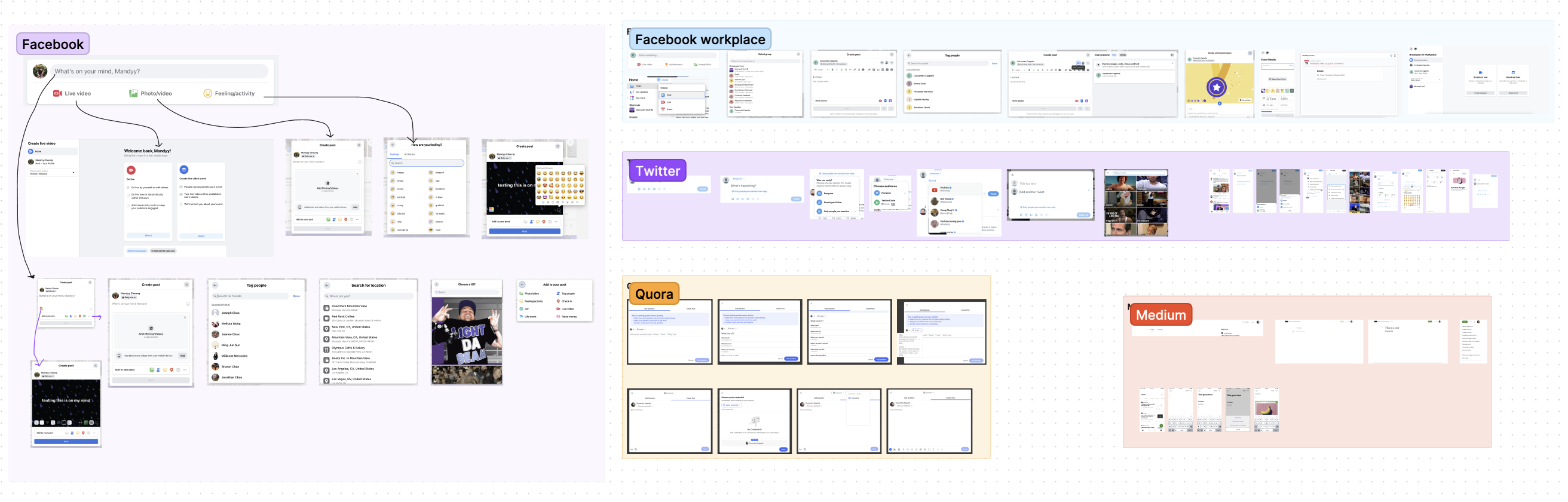
We uncovered a few commonalities between competitors that we thought could improve our product offering:
Simplification: Our publisher is the most complex one on the market, so how can we make it easier for people to use?
Scalability: We need new architecture, more similar to some of our competitors to allow for easier feature expansion.
We can improve and simplify how we display different types of posts to our users
Many of our features don't exist in other publishers, which in a way can be viewed positively, but how do we not overwhelm our users?
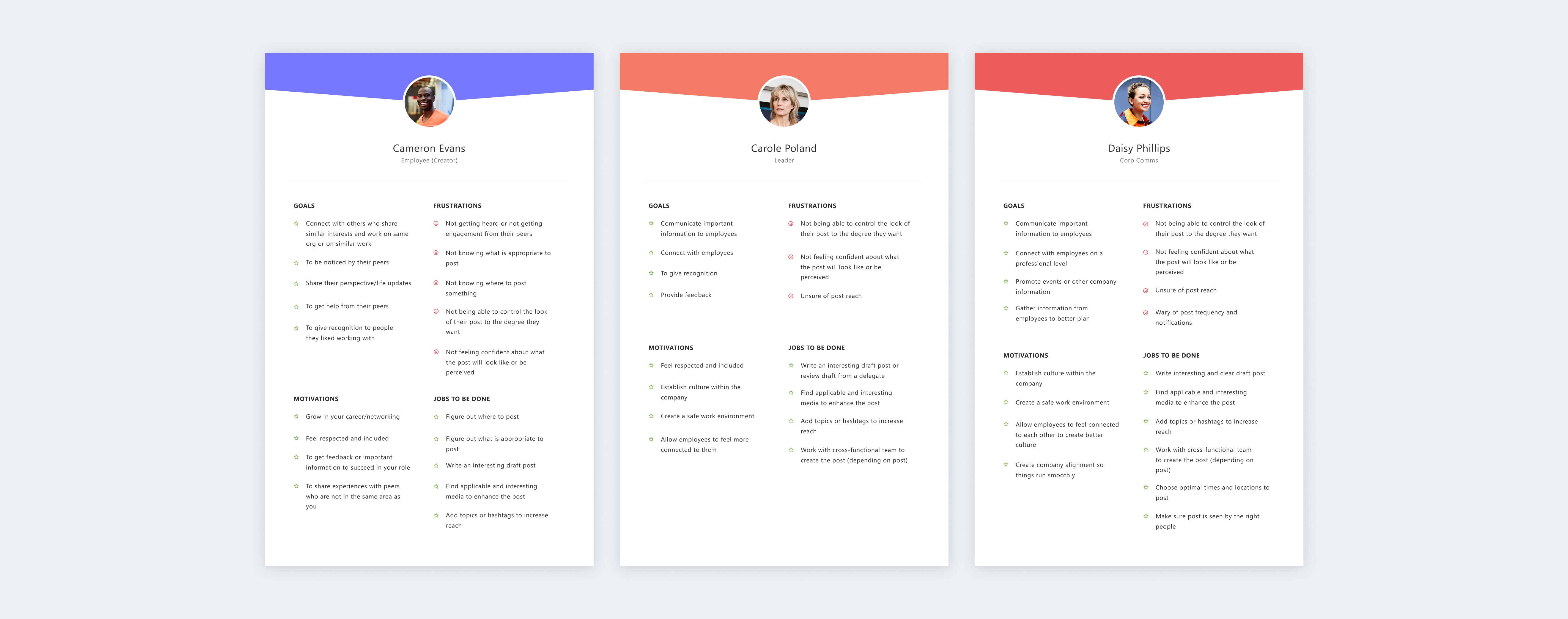
I created three documents outlining the user roles which includes the user goals, motivations, frustrations, and jobs to be done. Any user of the app can create a post, and the purpose of a post will vary. But all users who create posts in Viva Engage fit into one of the following personas/roles.
Some of the issues that came up with our current entry point are:
Post types were often confused for tabs
Users feel the entry point is quite tall
People mainly use the discussion post type (our default post type) and don’t often use the others

We explored many different designs and found that they all fell into a few categories: a single row publisher, a two row publisher, or a button. While trying to address the current UX issues, this was also a huge UI exercise for us.
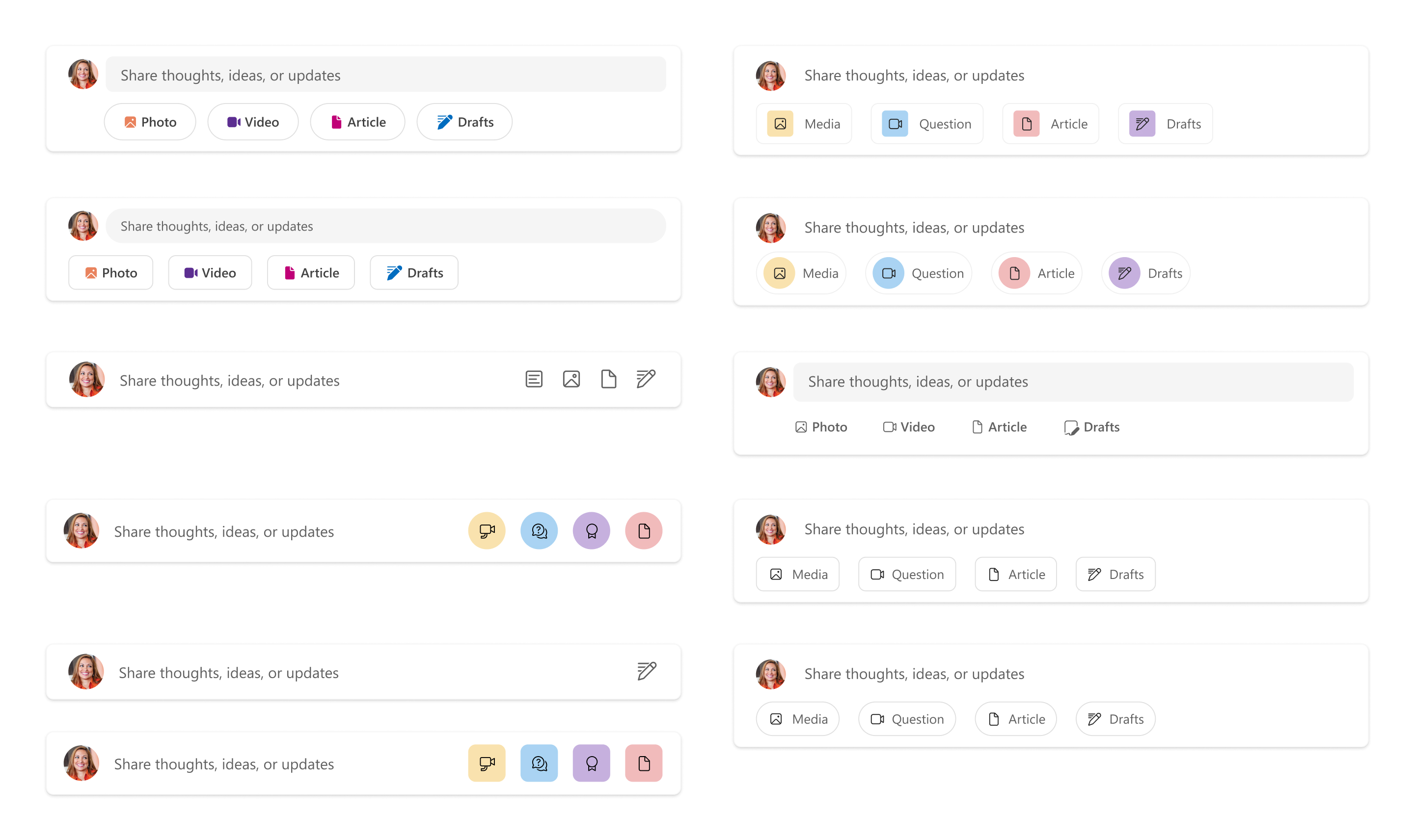
We tested with 15 participants, separating them into groups that saw the options in a randomized order. There were many explorations, but we narrowed it down to 3 main concepts that we eventually user tested:
Single row publisher
Two row publisher
Create button to open publisher
Lack of labelling of drafts caused a lot of confusion
Thought the drafts icon (to access your draft posts) was a compose button
People found it less discoverable
Well received by users during the test
Easiest option to find drafts and other post options
Some users found it confusing because the input field doesn’t expand, instead it opens a modal
Well received by users during the test
Drafts and scheduled posts was too hidden, people had a hard time finding it
This option was the best understood during the user test and by far had the lowest amount of negative feedback.
Provided the most information and clarity to users.
Post types were no longer mistaken for tabs. Part of that could be because we do not have any of them automatically selected.
Accessing drafts was the most clear and easily accessible/discoverable.
We noted that the publisher's height was pushing down the content in the feed. However, it emerged as the top-performing option, so the height has remained unchanged.
We considered this single con a tradeoff for all the other pros. We will do further testing with more minor design explorations in the future to try to address the height.
Some of the issues that came up with our current publisher are:
Opening in line pushes down feed content
All functionality of the publisher is limited to the bottom tool bar
Destination and tagging people sharing the same input field
Icon inconsistency
Limitations on media functionalities
Lack of space and flexibility to add new features
Very small area to write your post
The user doesn’t have a clear understanding of how their post will look in the feed
There were once again many explorations. We considered at fitting all things into one publisher, making it a 2 step process or multi-step process to post. Based on our competitive analysis we found that our publisher was much more complex than any other we came across, which made it difficult to fall back on common UX patterns.
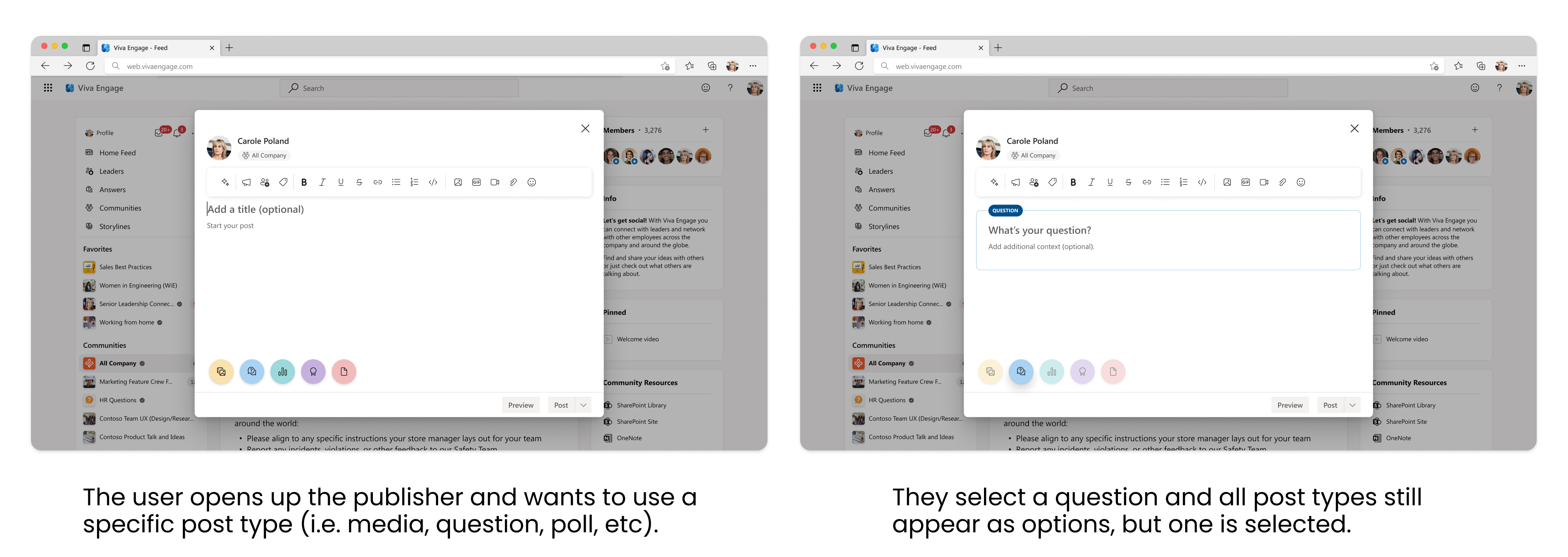
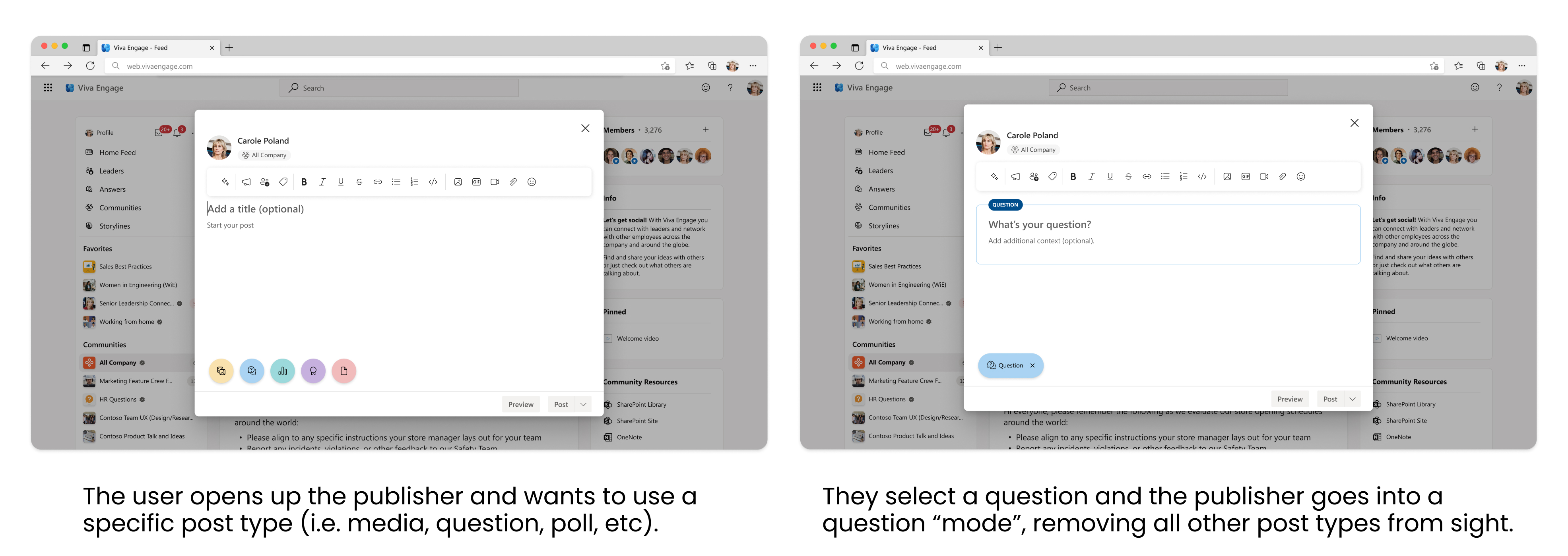
We tested two different options when it came to users selecting a type of post. We used a within subjects design with 10 participants, separating them into groups that saw the different options in a randomized order.
Pros: We think this will expose users to all of the post types, making them more likely to use them. It is also less effort for the user to switch between post types if they change their mind.
Cons: It is possible that all post types being present could be more distracting.
Pros: Entering into a “mode” removes the issue of distraction, and can bring clarity to what the user is doing.
Cons: Users don’t have a birds eye view of all our post types, and it becomes more effort to switch between post types.
Liked that they could more easily switch between post types
Felt faster to move between post types
Users were more likely to explore the different post types during the test
Some users felt that seeing all post types was unnecessary
Liked the additional label
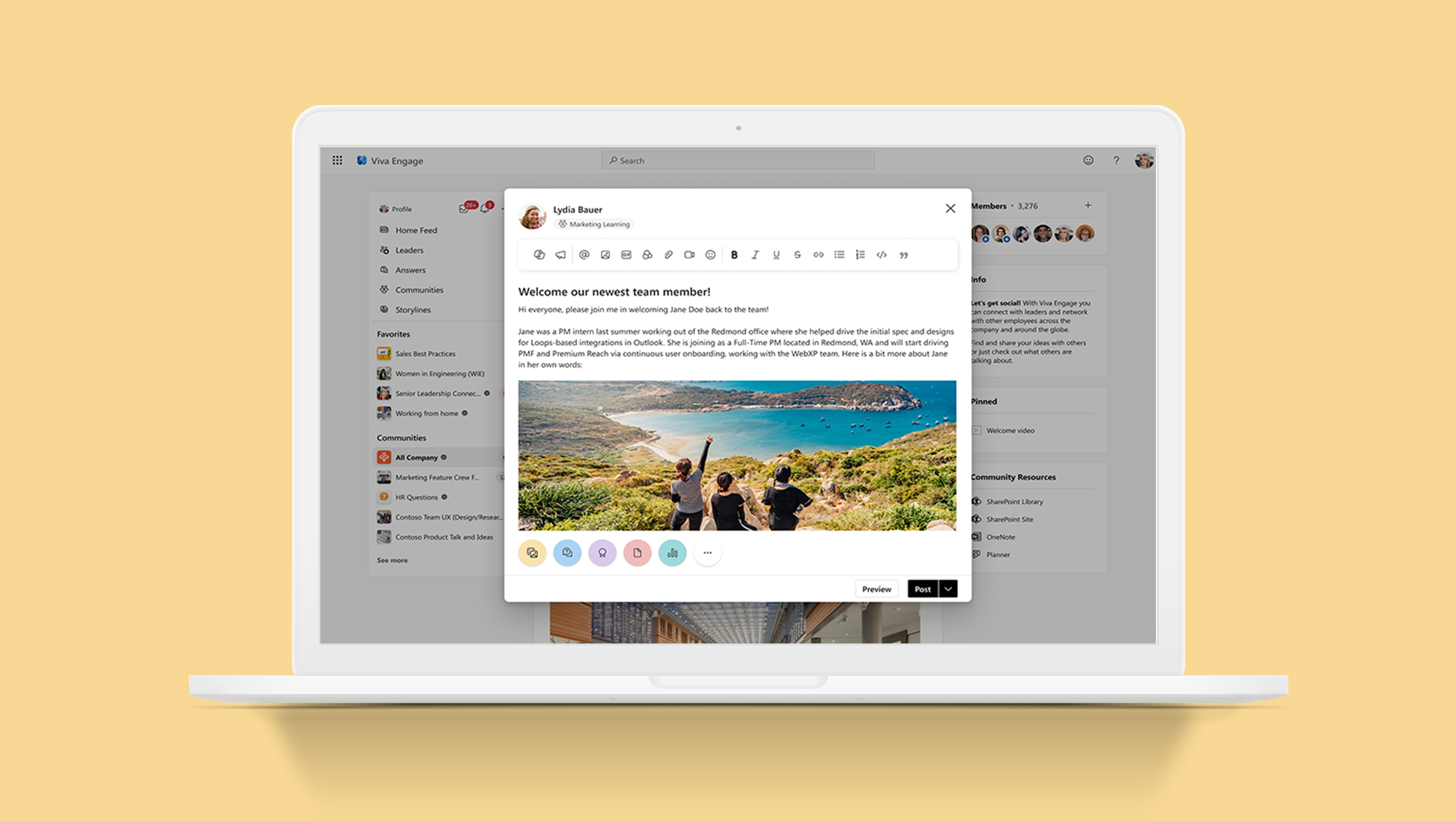
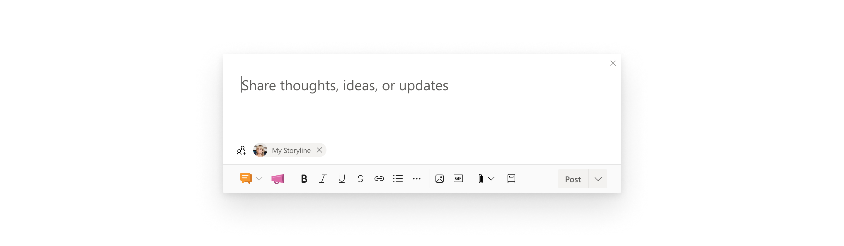
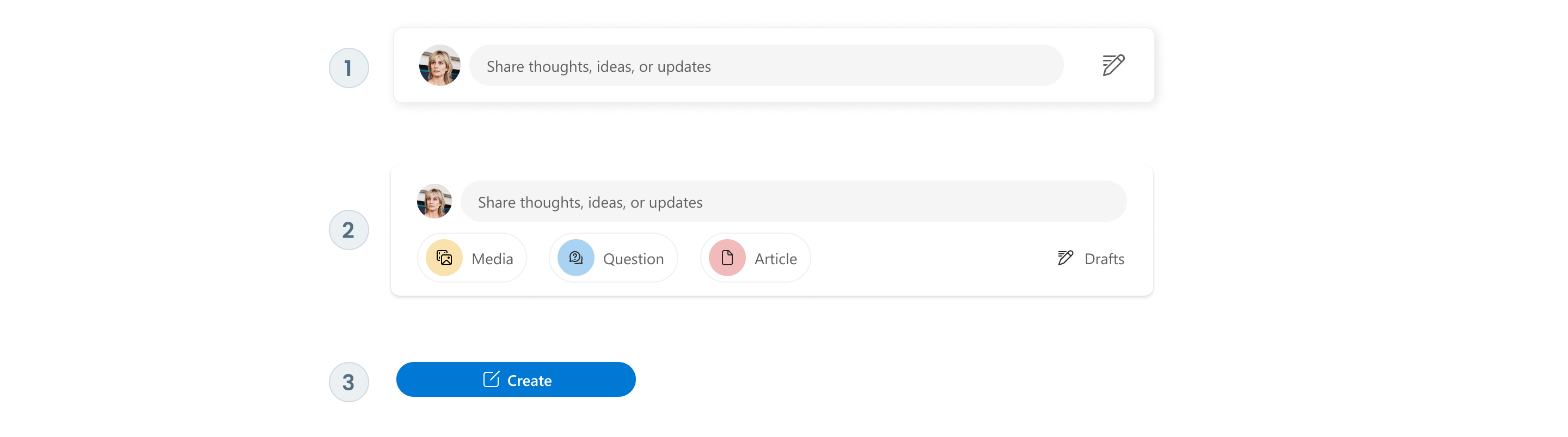
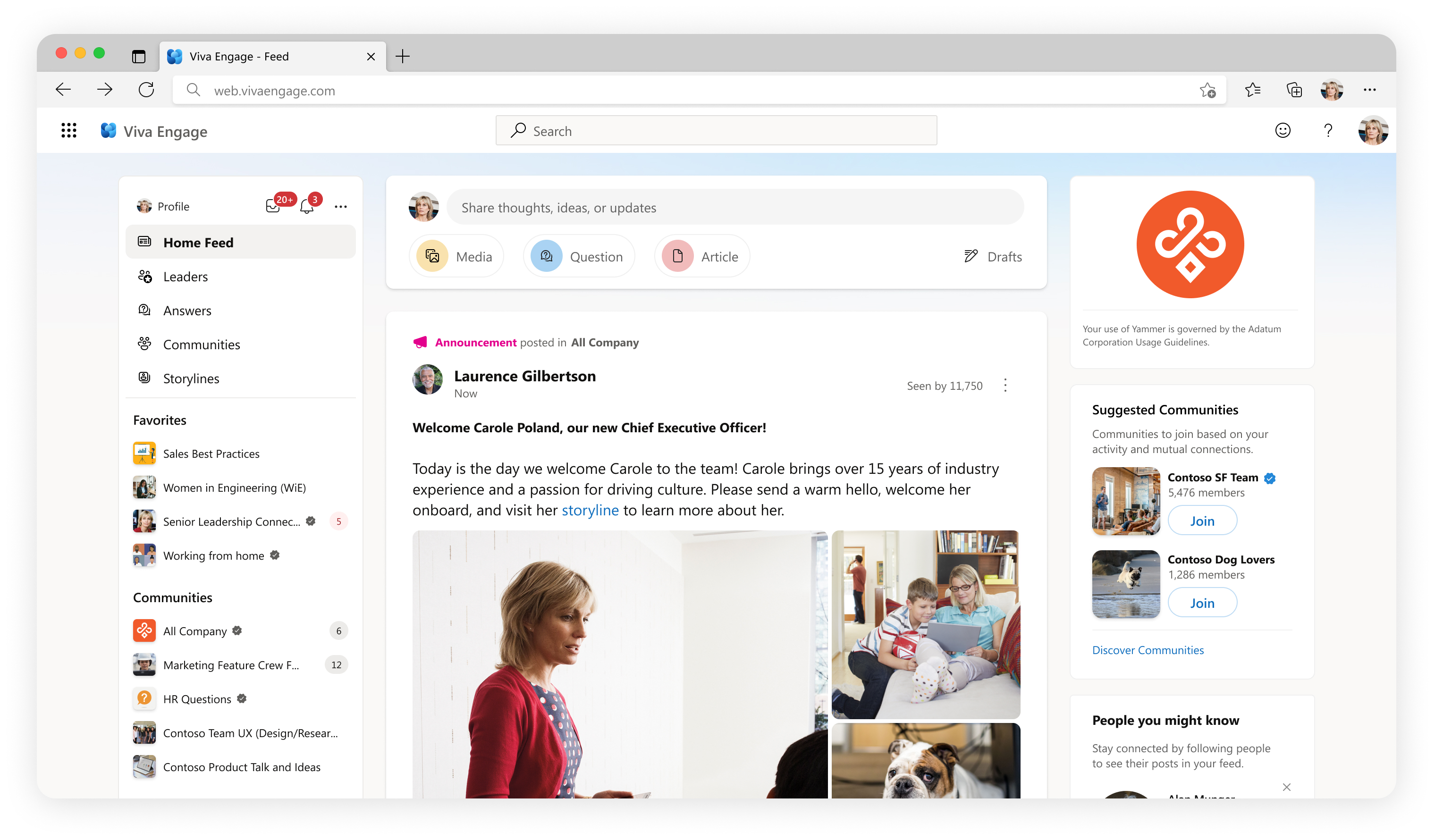
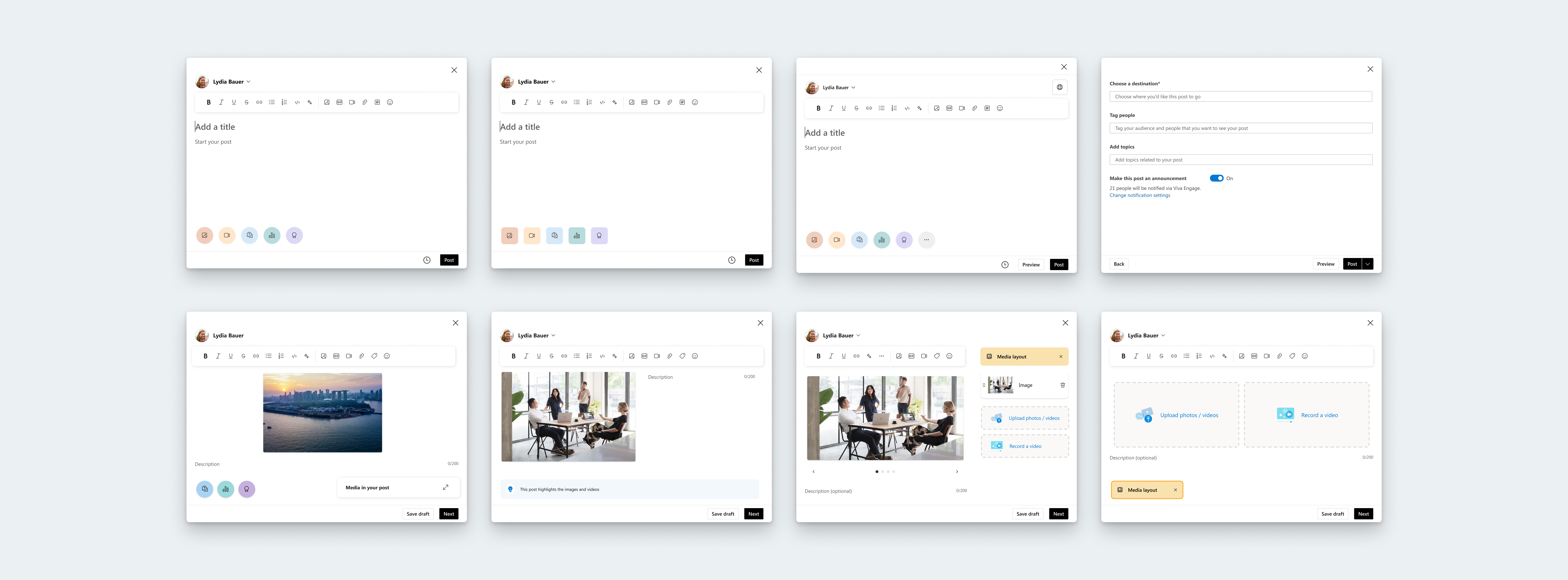
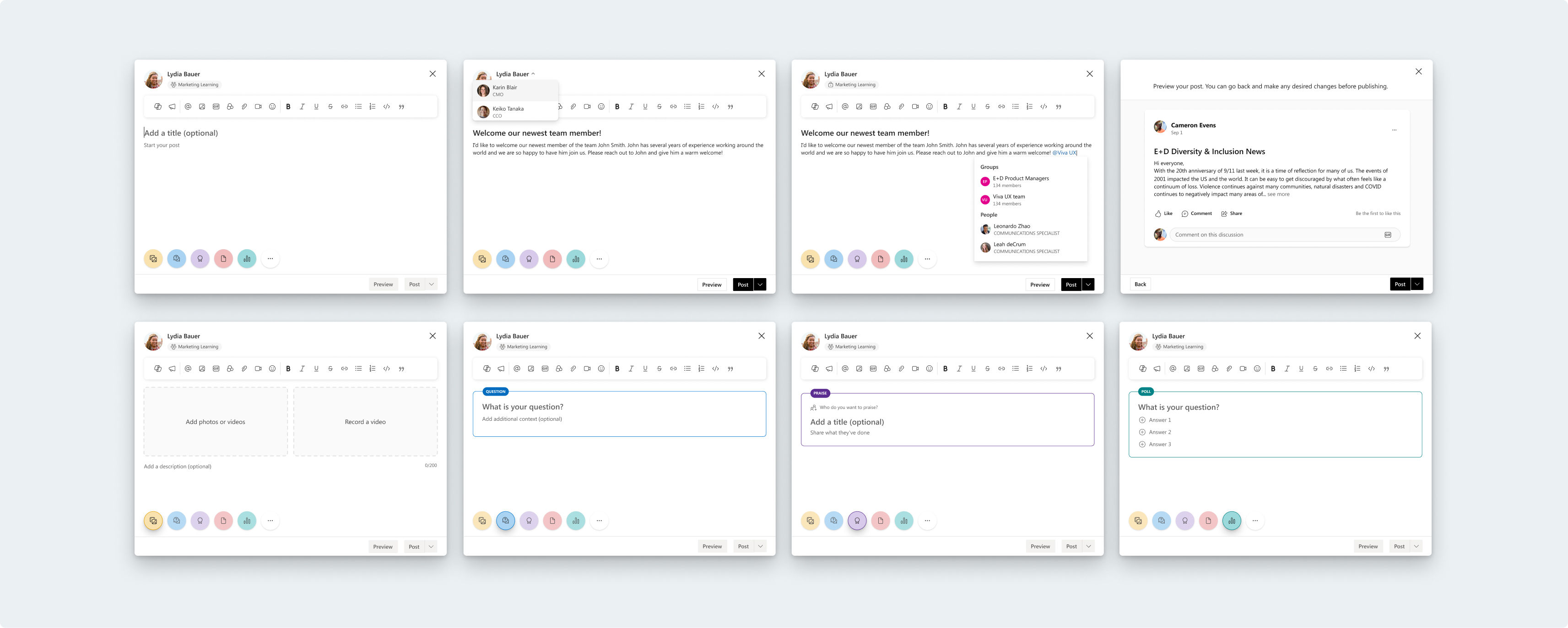
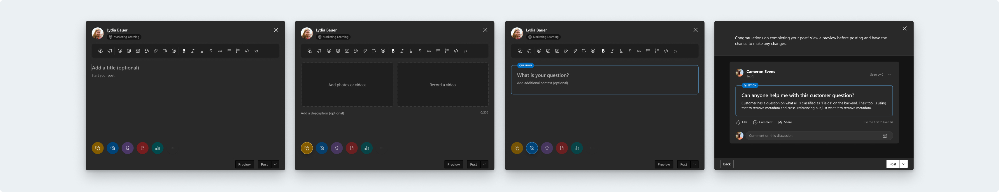
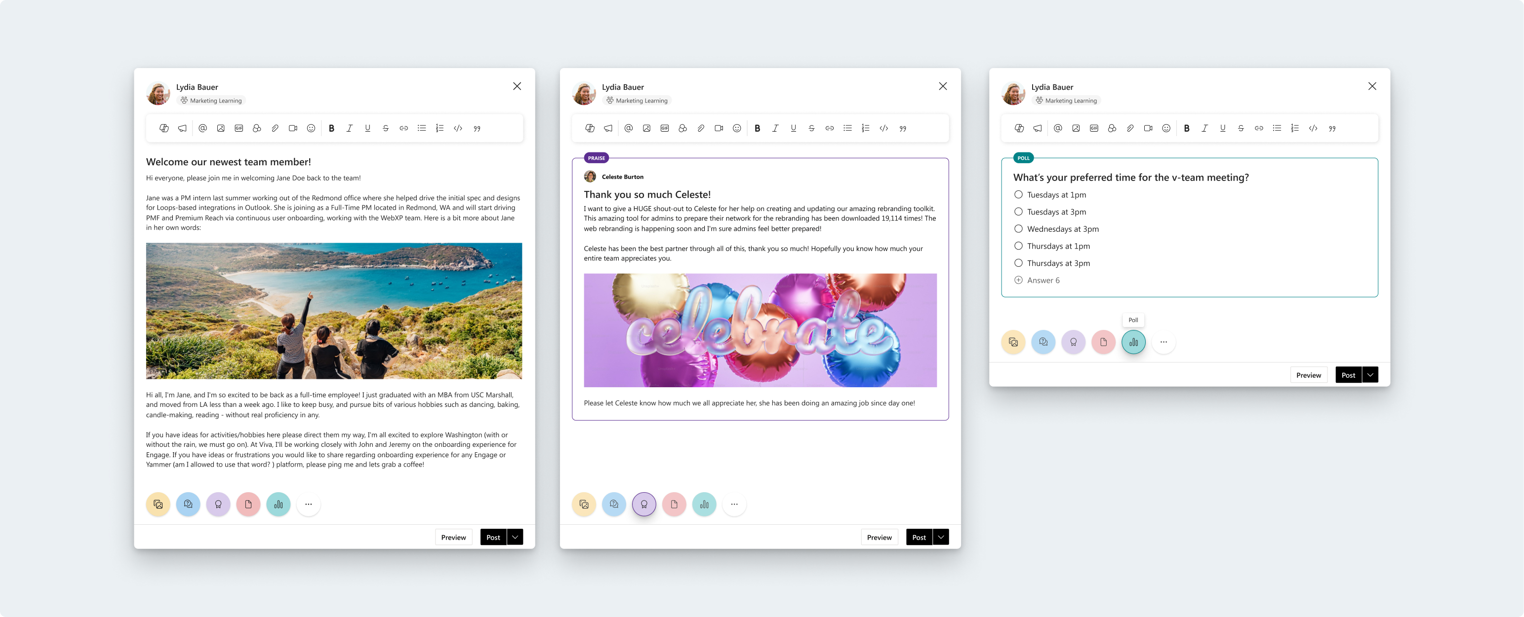
I was able to address all the outlined issues with the publisher. Some notable improvement areas were:
How the publisher opens–it now opens in a modal to allow for more space to write, and allows more room for the new Microsoft Copilot experience.
Creating a more accurate, WYSIWYG experience.
A clear location for accessing post reach.
We gave users the ability to preview their posts; something that users have asked for over the years to improve psychological safety.
We gave users more autonomy when it comes to adding media.
We’ve created more action areas for the design system to easily expand when more features are added in the future.
Consistent iconography.
The publisher is one of the most complicated feature areas in Viva Engage, and I’m glad I got the opportunity to tackle the many user and buisiness problems that have arisen in this area over the years. The publisher is a high touch area, and I want to keep experimenting with the design as we roll it out to users. Here are the next steps:
Addressing the order of operations for posting
Providing users more guidance when using new publisher features