TouchBistro's restaurant management program is a cloud-based web app that houses all the information required for a restaurant owner or manager to run their business. This project was twofold; the product team wanted to give users the ability to create their menu while not physically being in the restaurant. The second part was to create the ability for enterprise restaurant businesses with multiple restaurant locations to be able to create and edit their menus.
Not having a well-functioning feature accounted for a 30% loss of potential customers. One technical constraint I had to work within was that we weren’t updating menu management on the point of sale, therefore the two platforms had to have a certain set of similarities or else they wouldn’t be able to sync to one another.
The bigger business goal is to create an enterprise version of menu management in order to attract larger restaurant chains.


My initial question was how do I organize the menu? I conducted a card sorting exercise with restaurant managers and owners from our current customer base as well as our internal menu specialists. I wanted to find out how each of these users set up menus and why they did it that way. Due to our poor onboarding process to the product, I chose to set up the menu in the order required for a new user.
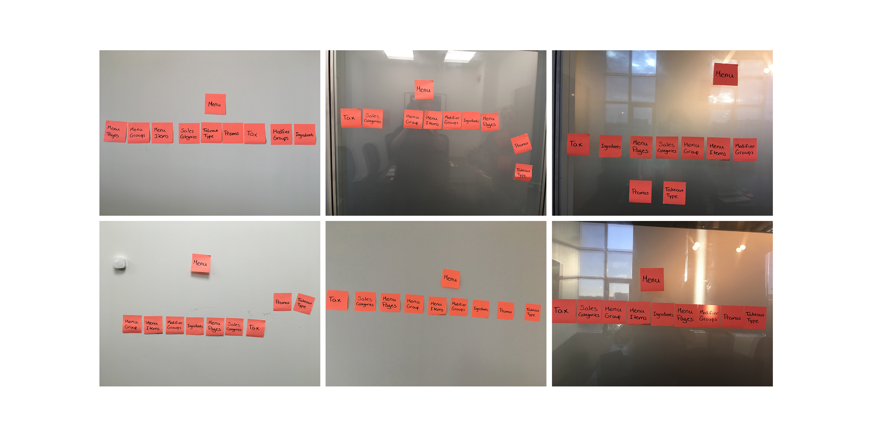
I also conducted interviews with both managers and owners and asked them about how they set up their menu currently, and what do they like or dislike about it.
Based on customer feedback, these are the specific features our team decided to add:
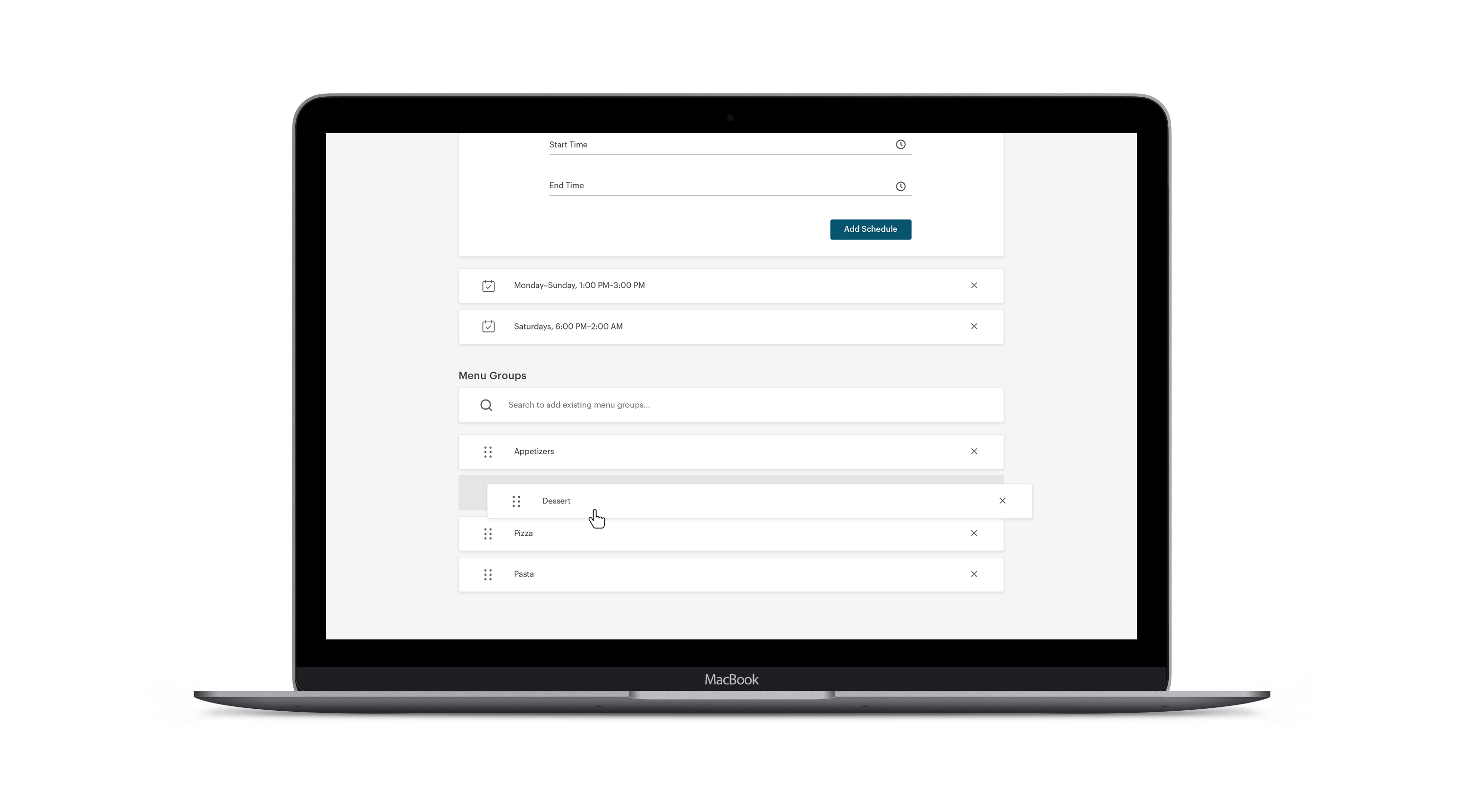
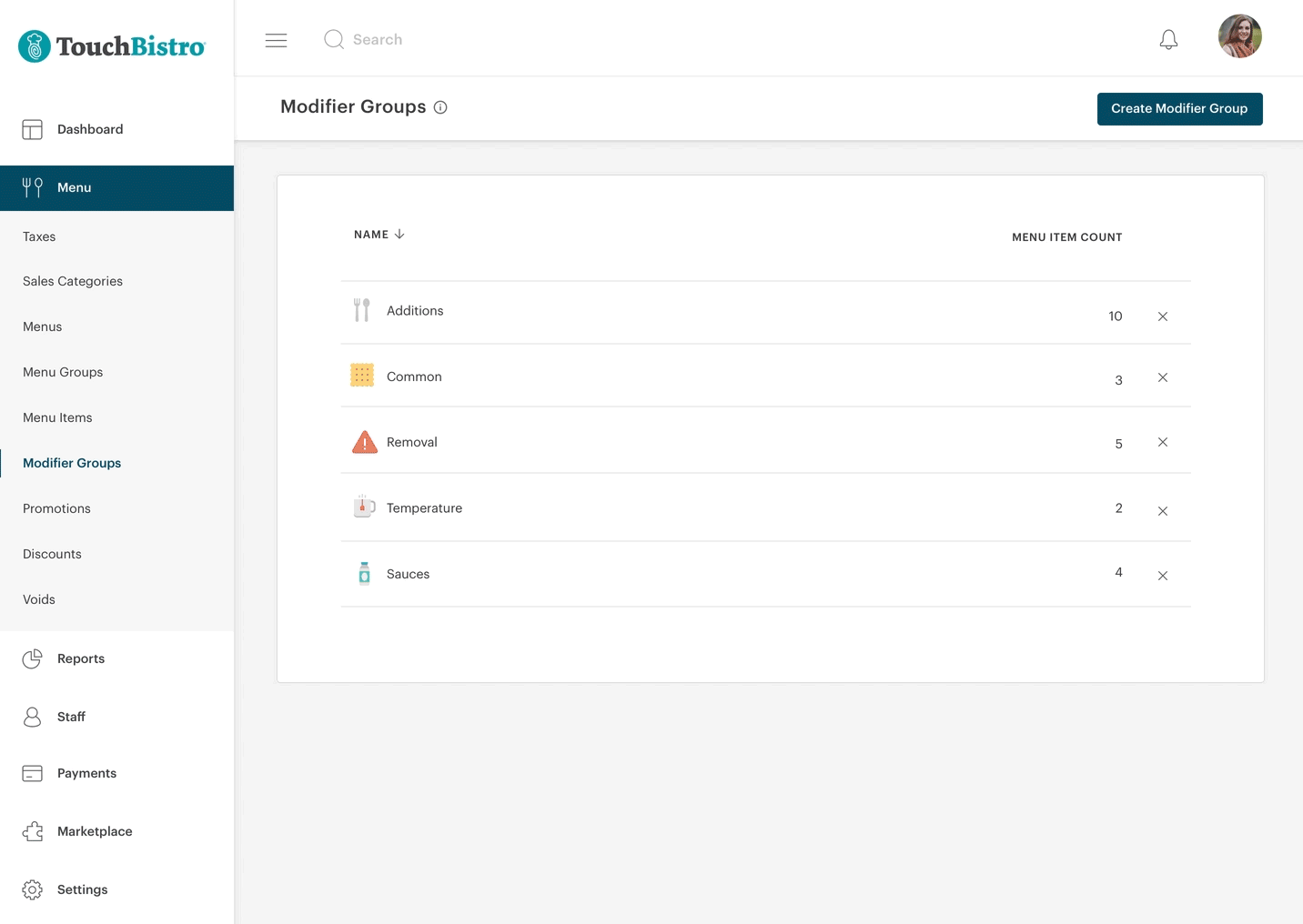
Setting a minimum and maximum amount of modifications added to an order (i.e customers can selext a maximum of two sides to their order).
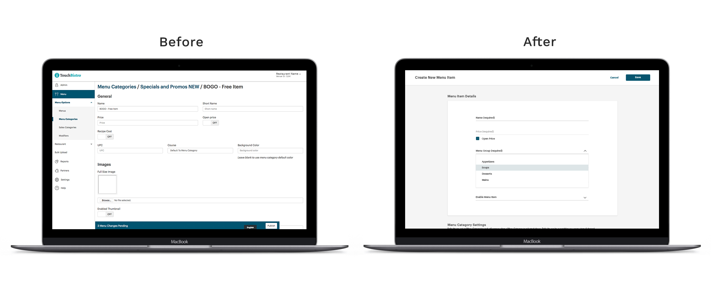
Improve poor mobile experience.
Give users the ability to drag and drop to sort items in a custom order.
Allow for auto fill to increase speed.
Include some kind of feedback to users after they perform actions (i.e save or delete).
Create more consistent language within the app.
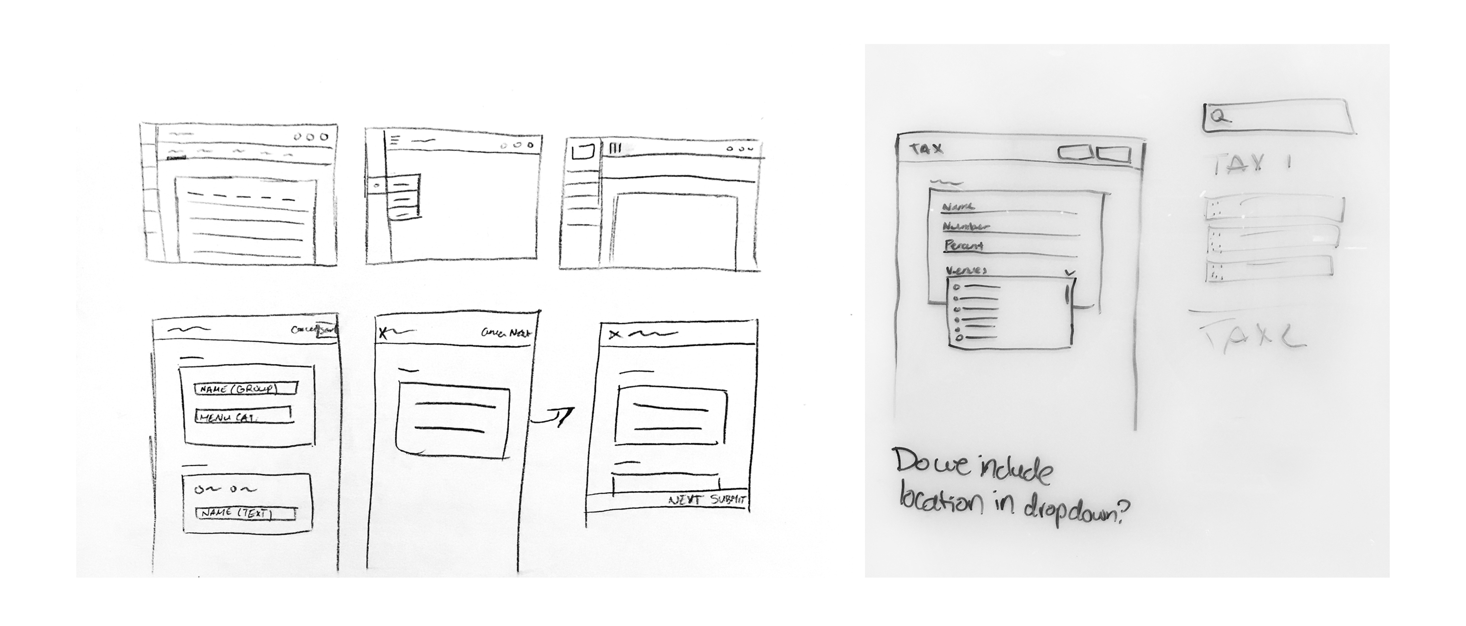
I created wireframes for the skeleton of the product, the tables, and the forms. If any new or confusing features came up throughout the project, my coworker and I would resort to drawing our ideas on a whiteboard. But this is mainly something that we did on and off throughout the project due to unforeseen scope.
During this time I focused on:
Creating a scalable design system that'll work for single and enterprise users.
Ensuring this feature would be accessible for all users.
Give users the ability to drag and drop to sort items in a custom order.
Fixing a poor mobile experience.
Getting stakeholder buy in on my high fidelity concepts.
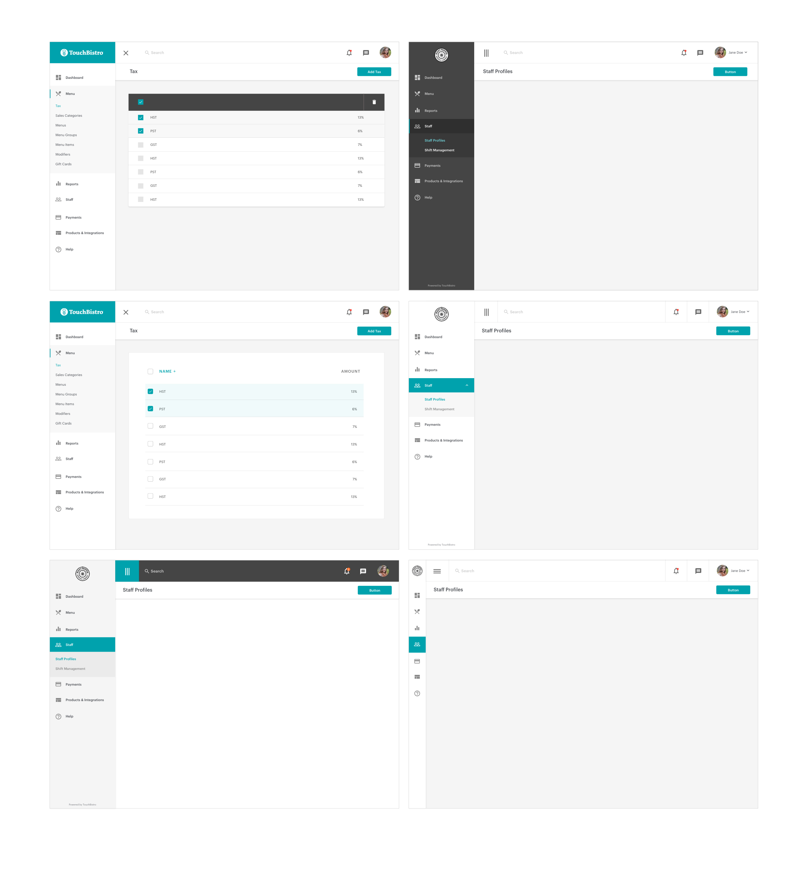
I developed a pattern library to ensure a consistent, scalable, and simplified UI/UX, addressing key shortcomings of the original product. Throughout the process, I iterated on the mockups to incorporate new insights and adapt to technical constraints.

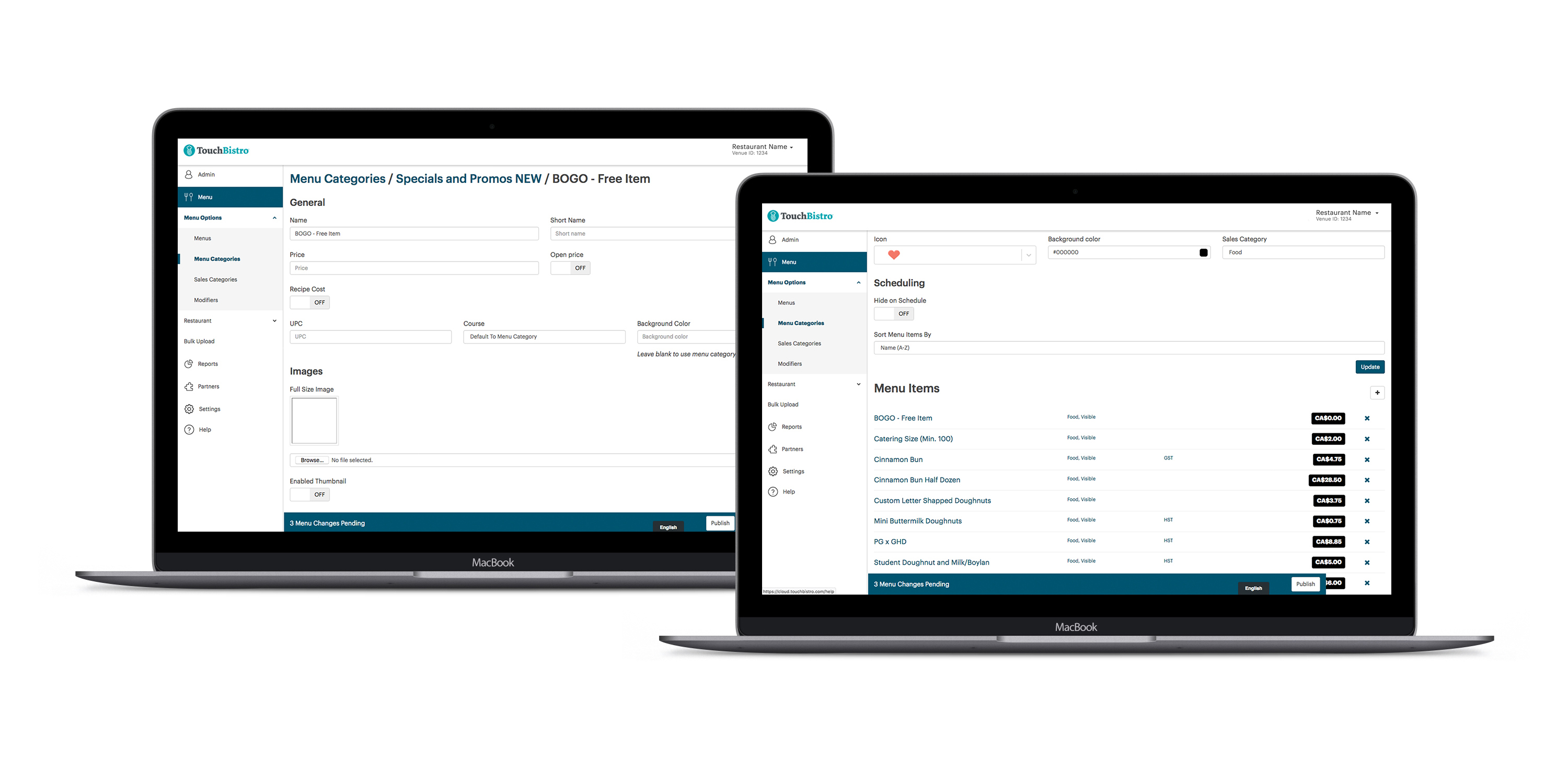
The enterprise design is almost identical in look to the non-enterprise design so that users who become enterprise users aren't confused by a totally new interface. For our initial release, the user needs the ability to access their own version of menu management, but have additional features allowing them to append menu information to certain venues.

About 90% of users adopted this feature and were considered retained after six months.
Users reported high levels of happiness and fewer frustrations via an NPS survey.
While tracking using Hotjar and Heap, I could see that people were successful in completing tasks.
Engagement for this feature is low due to the fact that changing your menu is something restaurants only do a couple of times a year, mainly users are just making minor edits if they're interacting with the feature.
I’m pleased with my focus on scalability and accessibility for this product. And I’m glad that our users could play such a large role in this project. They got to really test out this feature and give us their feedback so we could improve on it within our technical limitations.