This project is a payment app for a client of the agency I worked at. At the time, Apple Pay had just been released and my client wanted to jump onto the payment app train. The criteria for the project was quite open ended; I was able to brand the product as I saw fit, and my client was not trying to be particularly innovative in terms of features since payment apps were not as common as they are today.
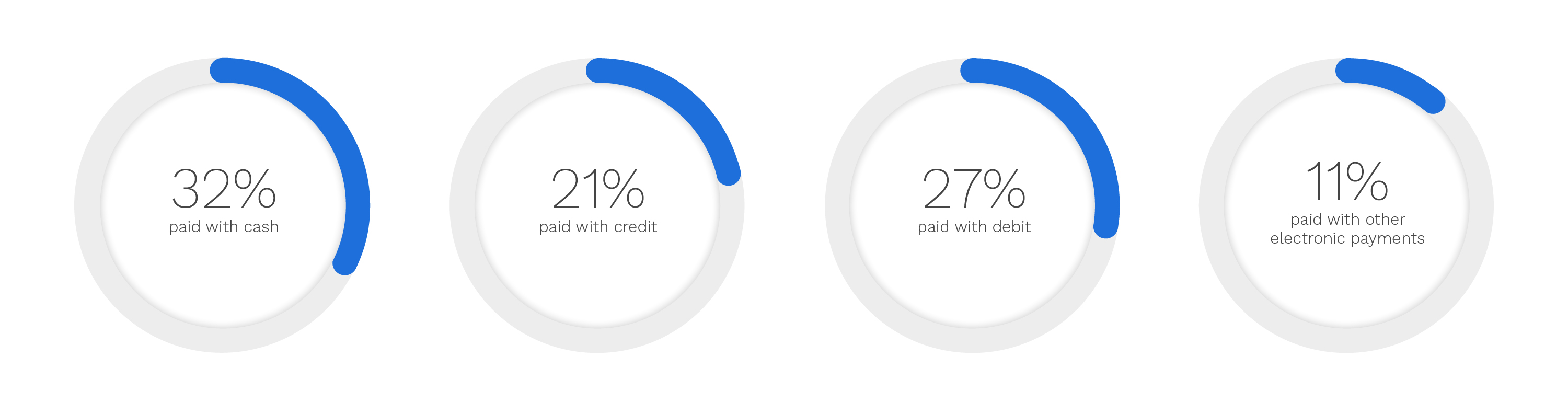
Around 2015, 32% of payments were done via cash, 21% were done via credit card, 27% via debit, and 11% of payments were done using some form of electronic payment. Compared to the study done by the Federal Reserve a couple of years prior, cash was on the decline, and card and digital payment methods were increasing in popularity.
I did a competitive analysis of existing payment apps, which at the time was Apple and Google Pay. I presented my research to my client and these are the features we I decided on:
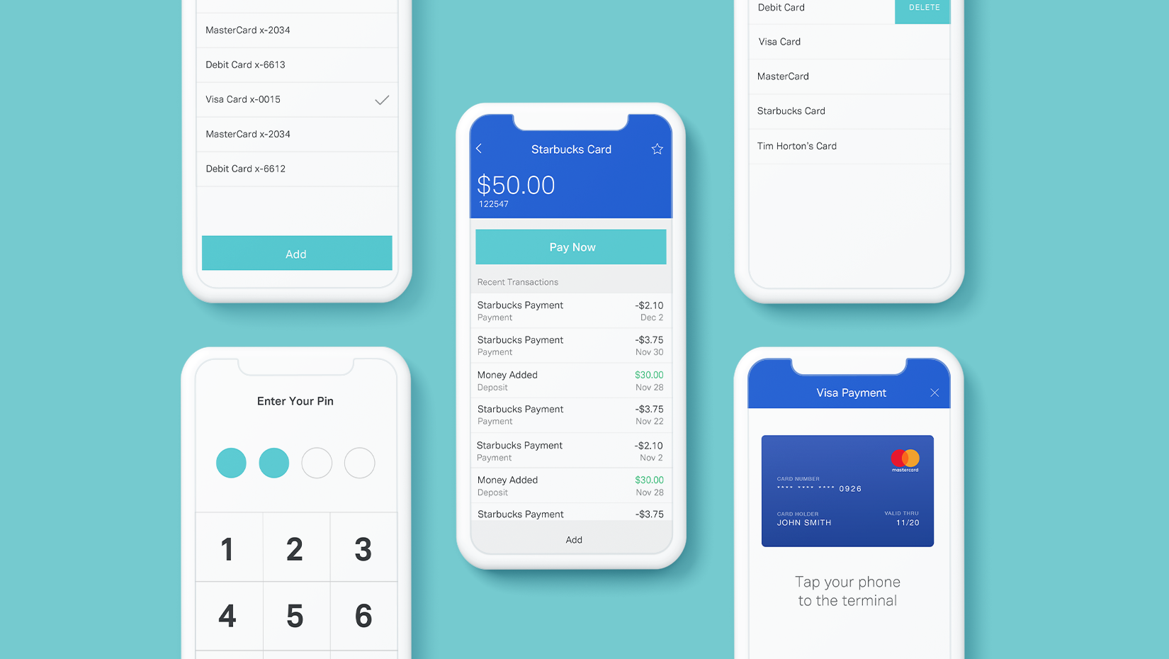
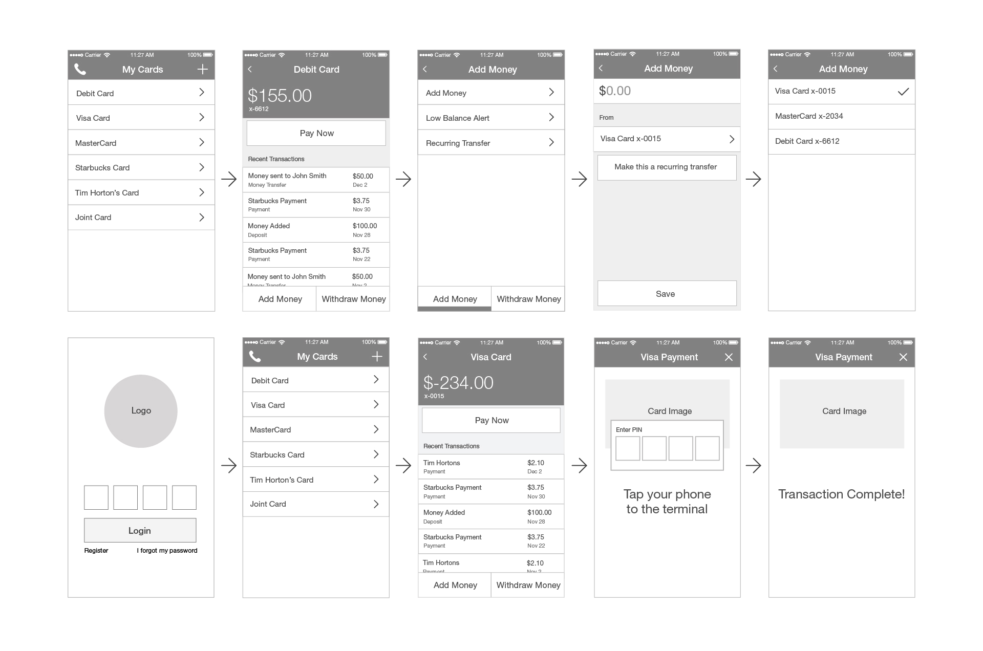
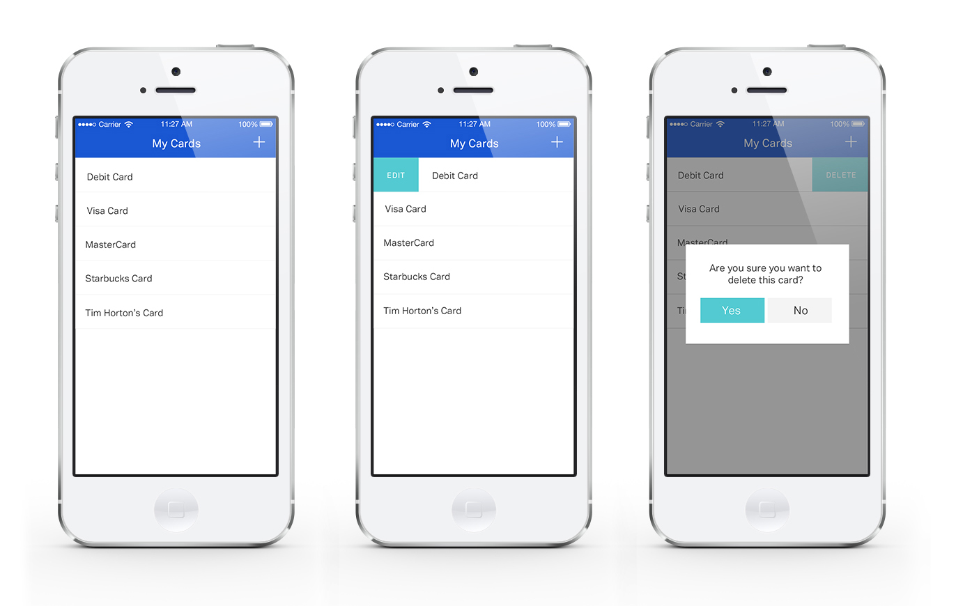
The ability to pay with and manage multiple debit, credit, and loyalty cards.
Users should be able to receive or send money to others as well as add money to their account.
Create recurring transfers.
Users should get alerts when their balance is low.
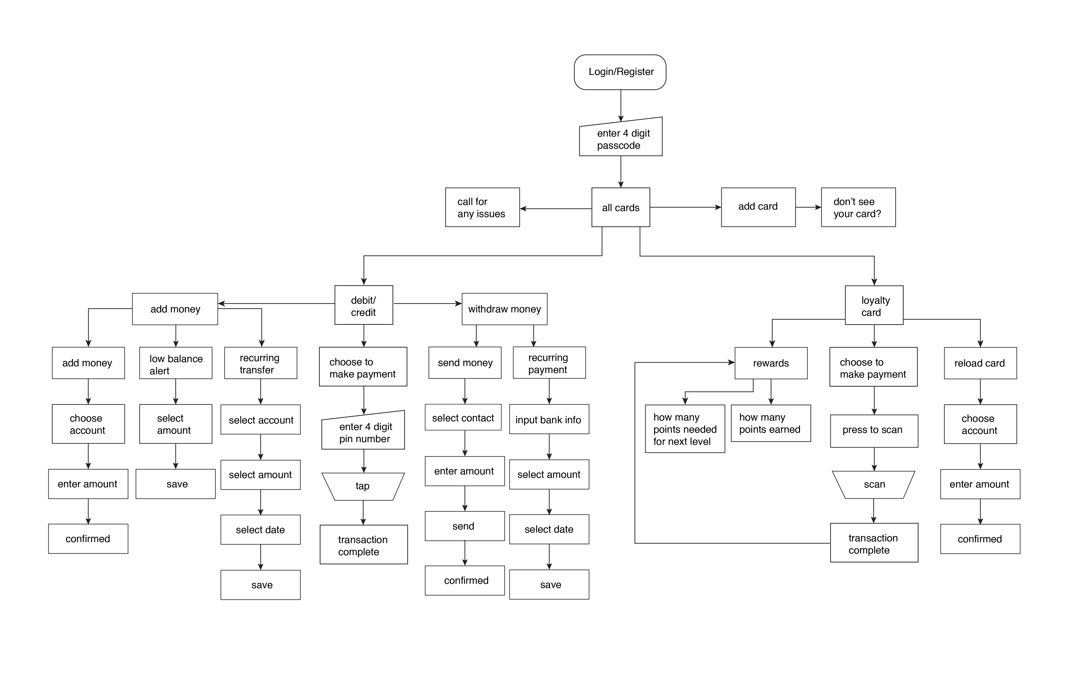
I created a user flow diagram in order to map out how users could move between features screens within the app and also shared it with the development team so that they had a full understanding of how flows were connected. There were no changes made to the flow at any point in the project since I chose to focus on it so heavily at this stage.
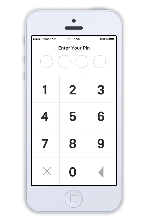
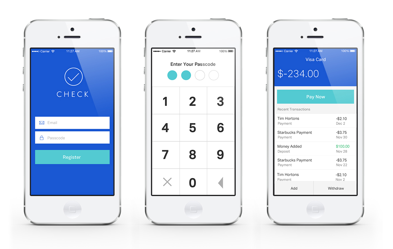
I made wireframes for every screen of the application so that I’d be able to go over the entire product with my client. I made sure the fidelity was high enough so that the client would understand what they were looking at. The newest challenge for me was taking security into account.
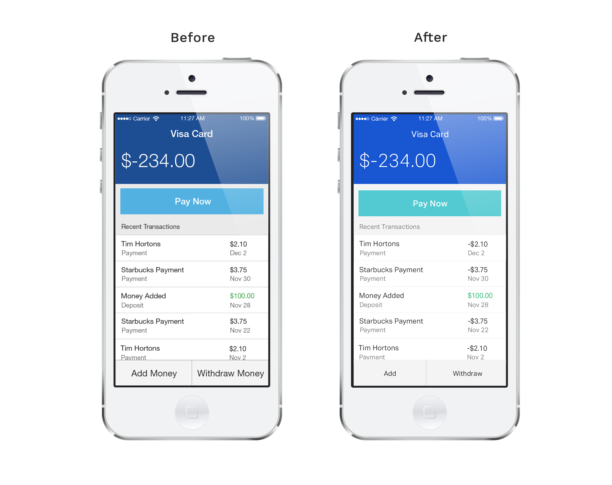
We showed the initial app mockups to several people who fit our target audience and they generally had positive feedback about the app. But they didn't seem as excited about the app compared to competitors. It seemed to be too bank like to some of them.
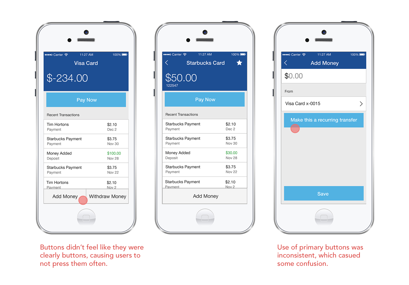
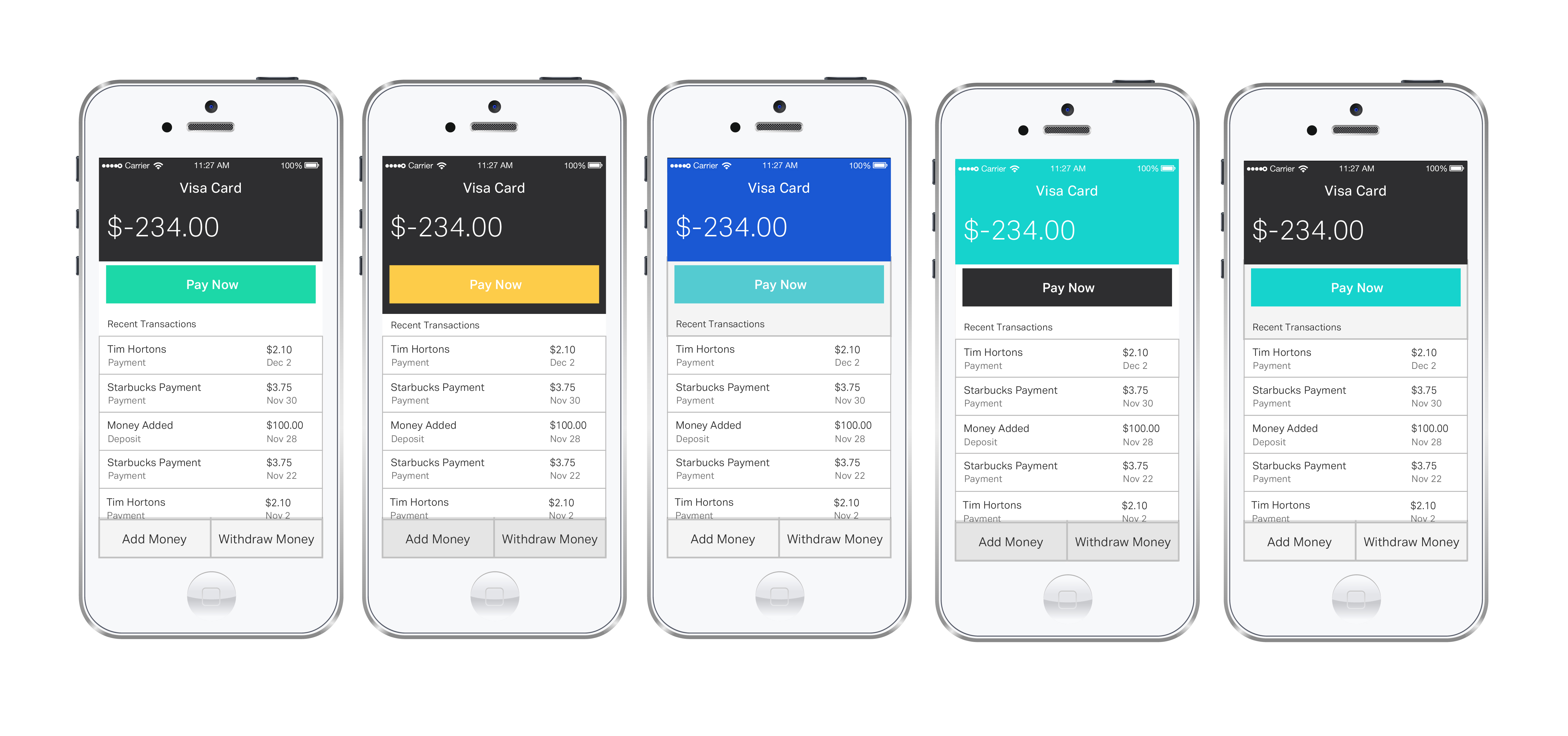
I went back to the drawing board. I started with exploring different colour palettes, I wanted something that felt trustworthy but more youthful and less stuffy than my original idea. I also explored visually simpler ways to guide the user through the steps of putting in your pin code, scanning, etc.
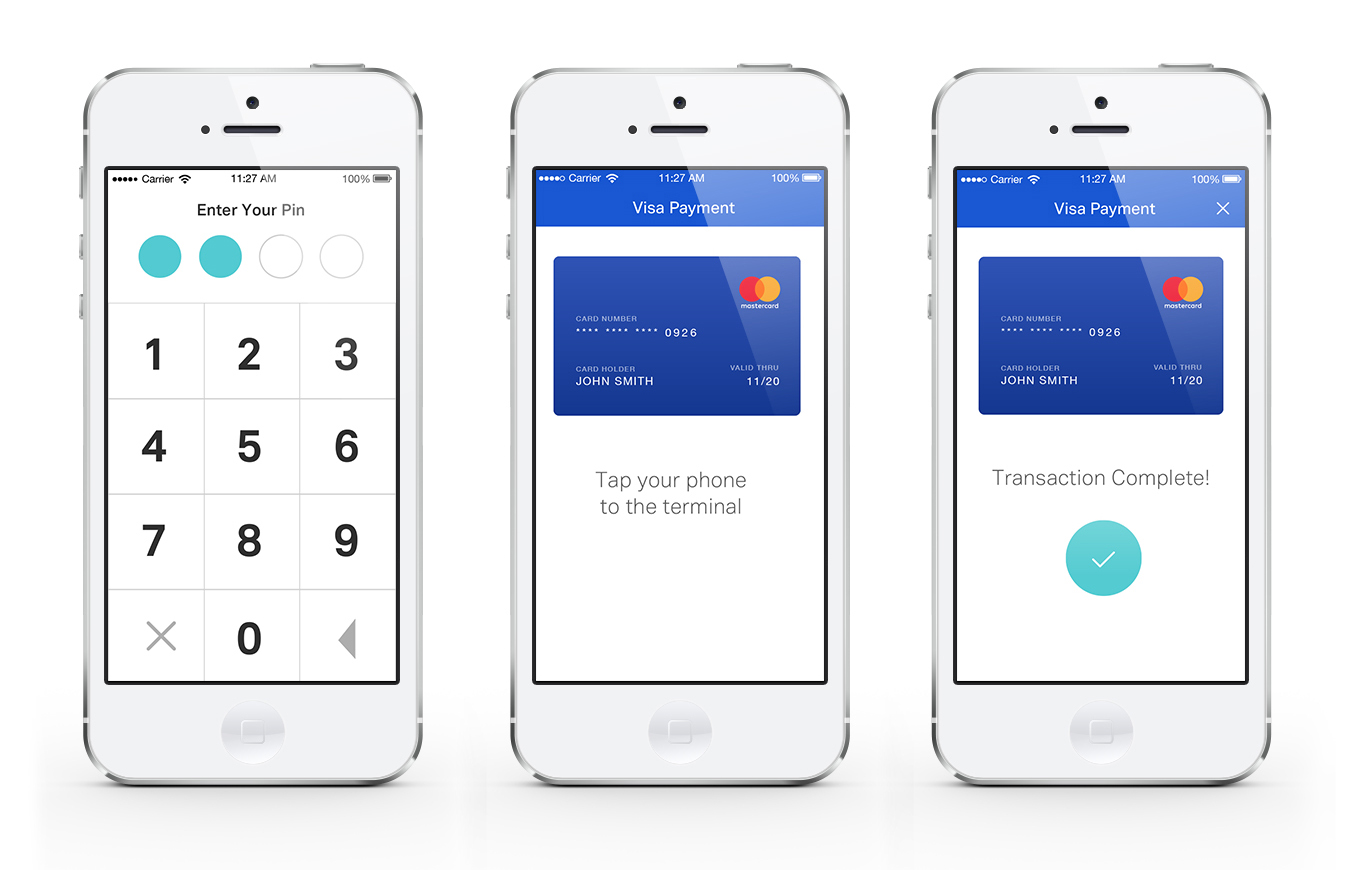
As far as the UI, I struggled more than usual coming up with an interface that would be attractive to our users. However, I am relatively happy with the result since my client’s customers were pleased with the look and ease of use.
If I had the opportunity to do this project again:
I'd want to do more qualitative research, with a larger number of users.
I'd want the opportunity to do more user testing, or having a beta period prior to release.
It would've been ideal to track the products success after release. But we were an agency and don't really have access to the product after a certain point.