Scheduled reports allows restaurant owners and managers to automatically email groups of reports to stakeholders on a consistent basis. Our users did not use this feature as intended and it didn't provide the value we expected due to a poor experience. My product team had to explore the value of this feature and how we could change it to improve engagement.
My product manager and I assumed that 40% or fewer of customers would be upset if we removed the feature, but we found that 64% said they’d be very disappointed and 23% said they’d be somewhat disappointed. So clearly this feature has more value than we expected. We set out to define the pain points customers were experiencing:
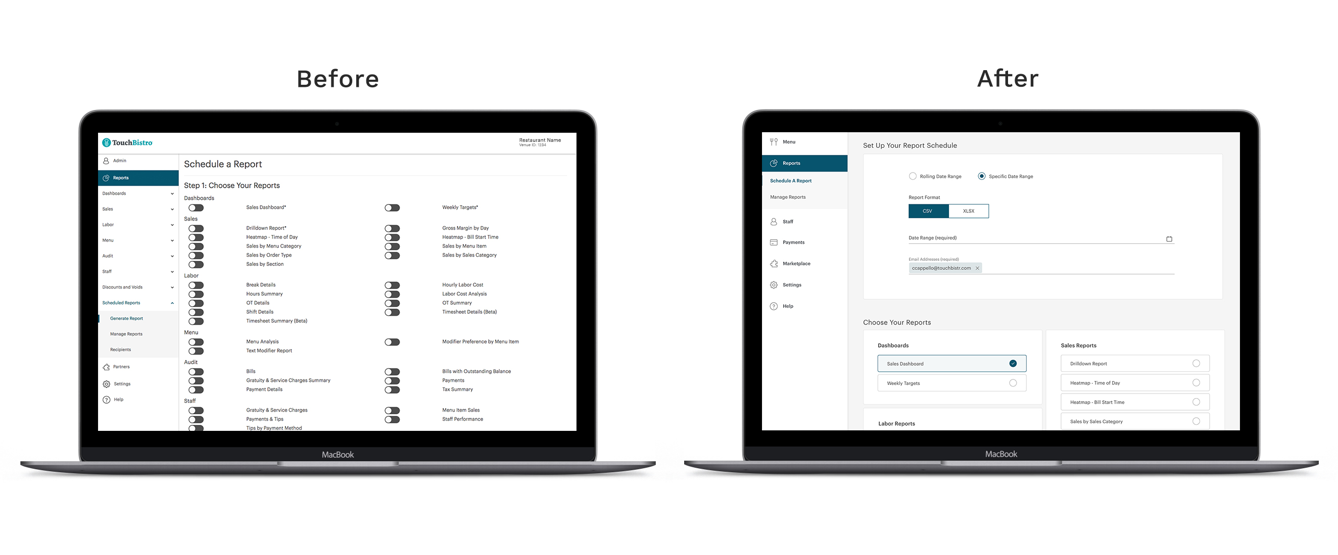
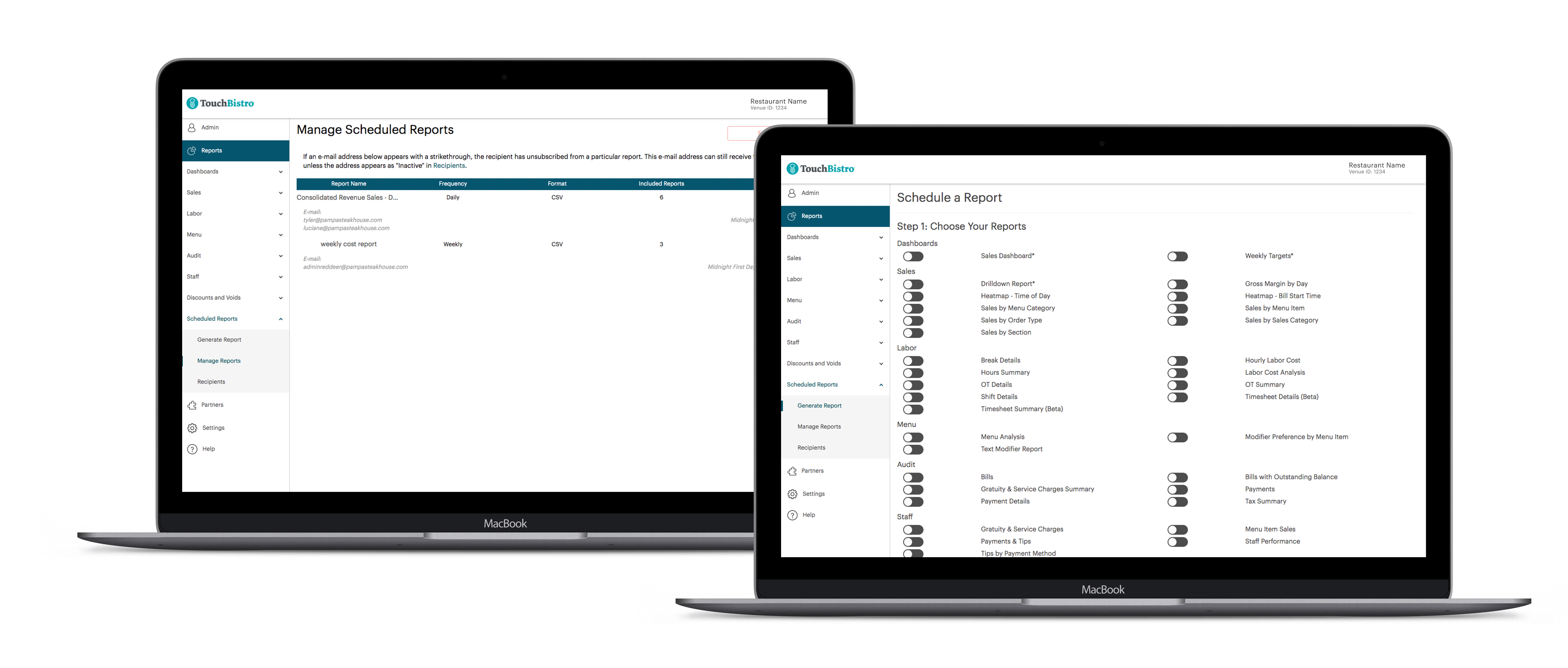
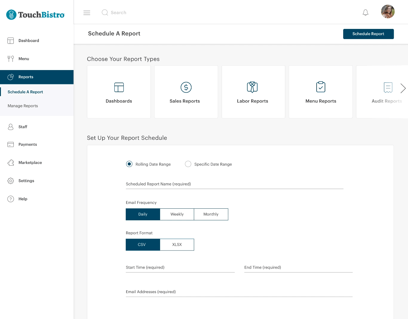
Managing several aspects of scheduled reports on separate pages was causing unnecessary steps and confusion for first time users.
Organization of reports was not easily readable.
Emails users received didn’t look professional. They actually looked like they could be spam.
Emails don’t have the option to embed the report in the email for a quick snapshot.
Users didn’t know some fields were dropdowns because of how they were designed, causing them to be unaware of all the options available to them.


My product manager and I discovered through our survey that the majority of our users found this feature useful. Most users said they were using the feature to do further analysis or get a quick snapshot of how their business is doing.
About 5-10% mentioned visual issues such as visuals being too complex or emails being difficult to read.
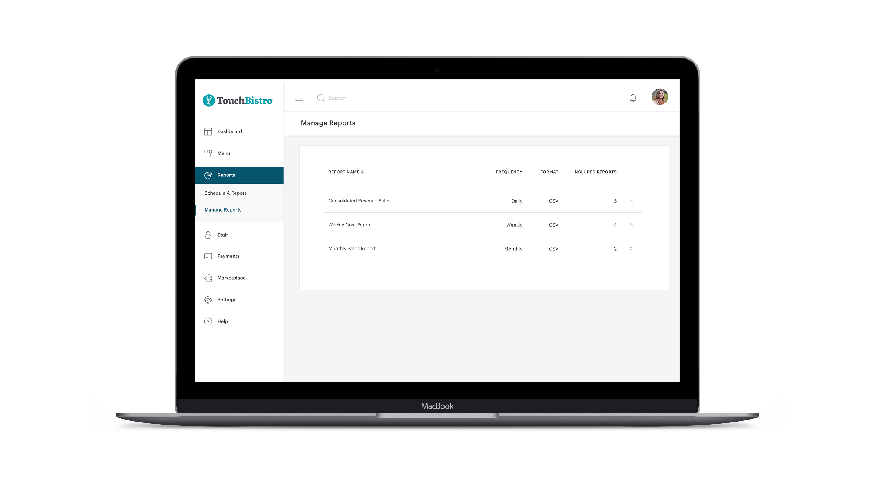
One of the biggest pain points was the feature requiring users to manage multiple related tasks on different pages. For example, managing email recipients on a separate page, which isn’t necessary.
Via existing data, I found that many users were consistently sending the same reports at the same time of the week or month, instead of scheduling them to automatically be resent. I assumed this is because the default field setting in this case is actually a dropdown but there’s no indication that there are other options.
64%
Percentage of customers who would be very disappointed if the feature was removed
23%
Percentage of customers who would be somewhat disappointed if the feature was removed
13%
Percentage of customers who would not be disappointed if the feature was removed
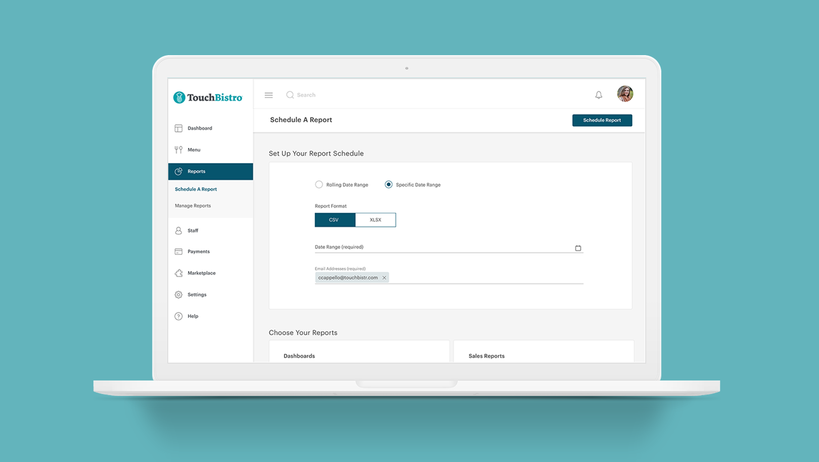
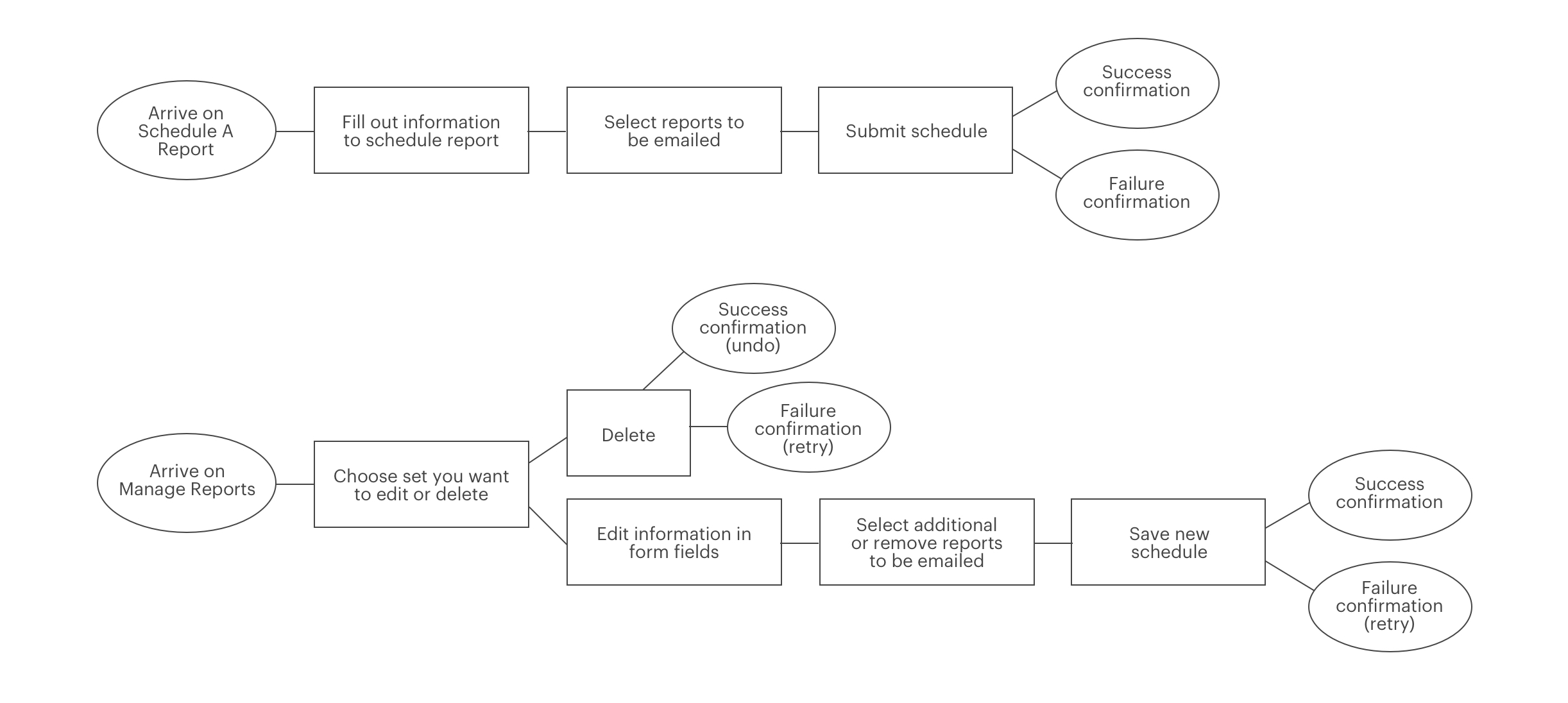
I made task flows for the current experience in order to identify any major issues and then created flows encompassing the possible improvements. I chose to remove one of the initial flows entirely, which was managing a list of email recipients on a separate page, prior to being able to send them reports. I felt there are other ways to handle email management that puts less strain on the user.
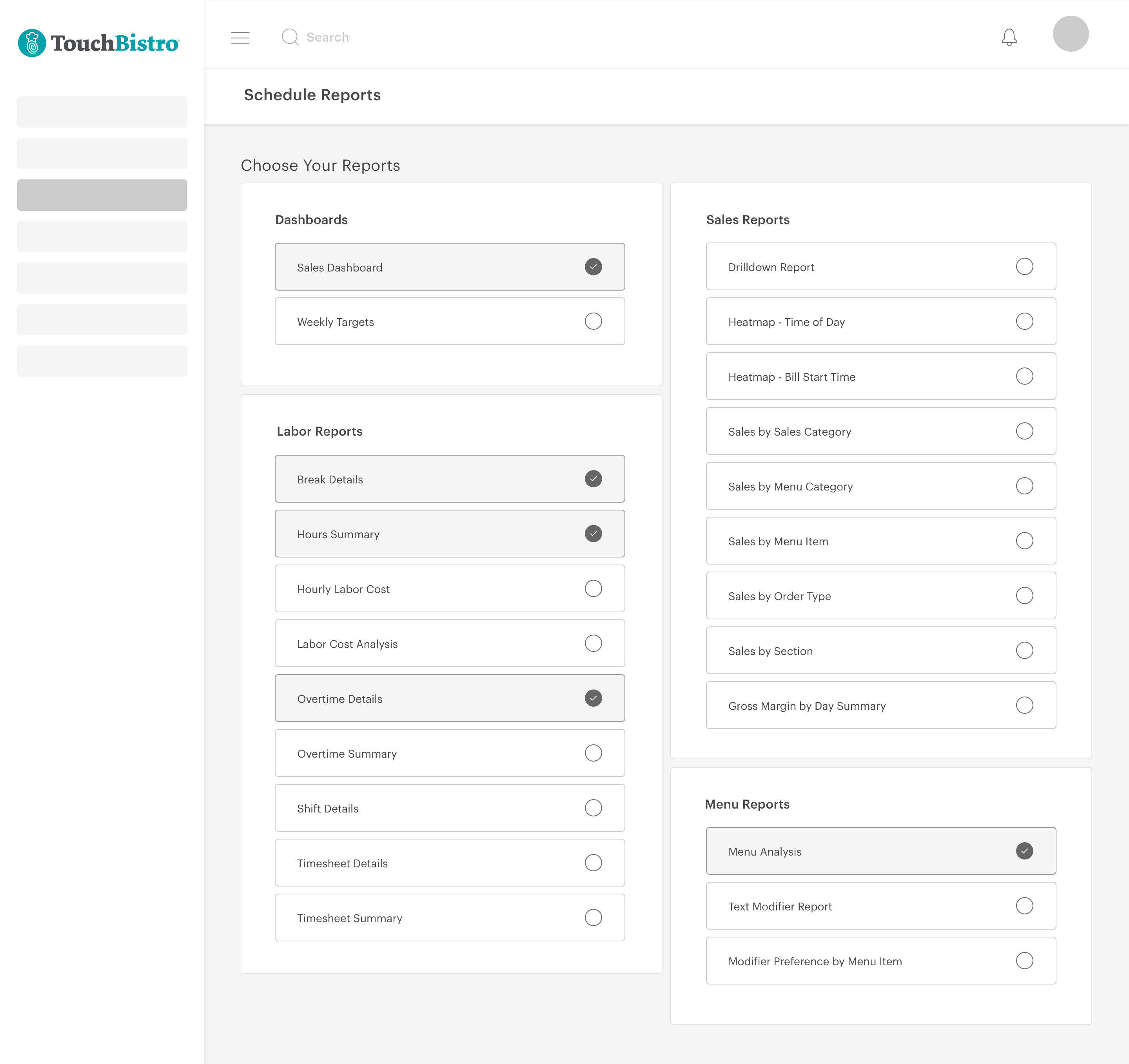
I then created wireframes to explore different approaches. The first concept displayed a comprehensive list of all reports, allowing users to view and select the ones they wanted to schedule. While this design offered clarity, it risked overwhelming users due to the extensive list of 50 reports available in our product.
My second concept was trying to make users feel less overwhelmed with their choices. To solve that I made each report section a tab. Once the user selects that tab, the relevant reports appear below. The only issue with this concept is that previously selected reports are hidden until the user reopens the section.
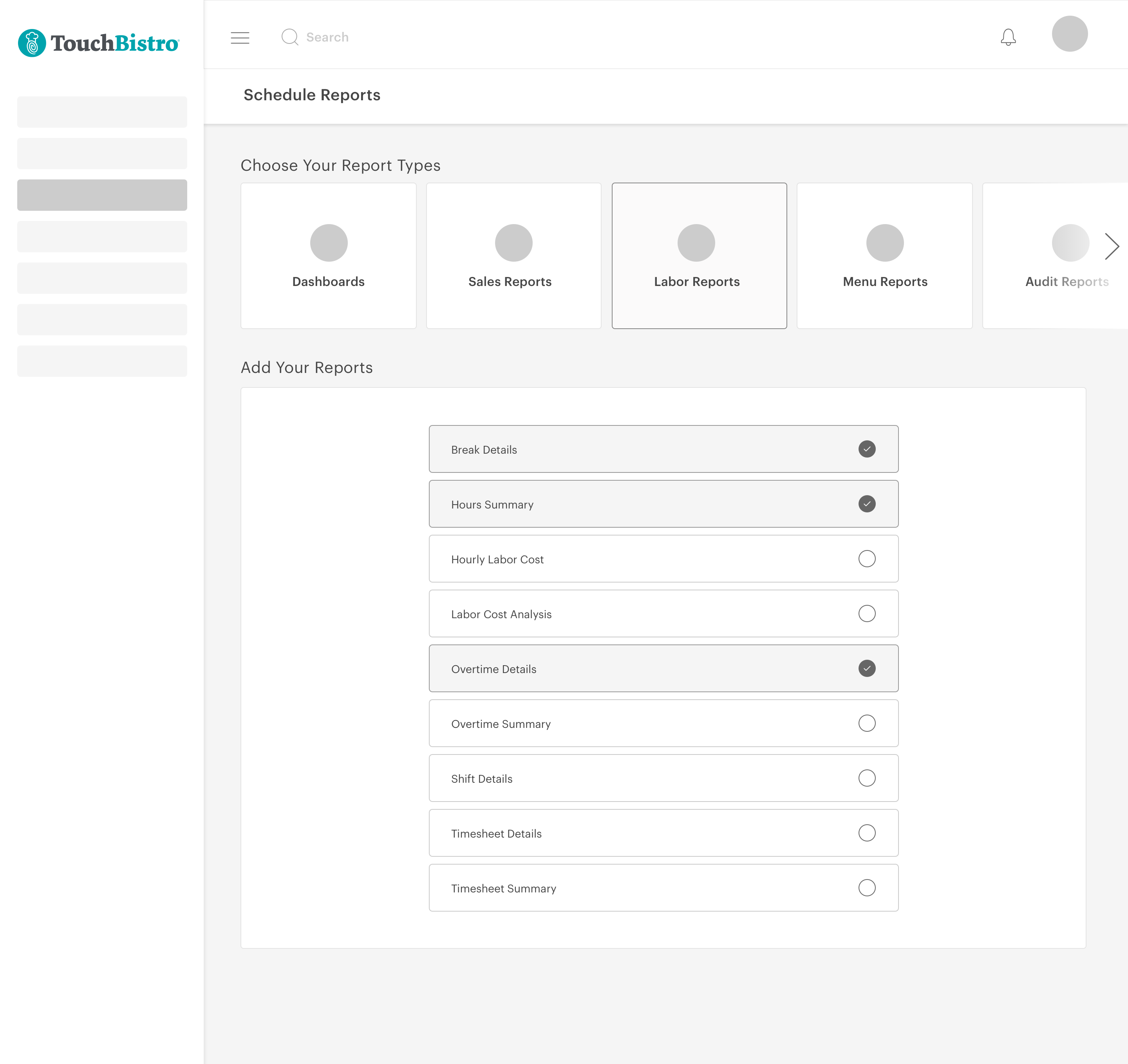
Issues I found with the forms were more clearly defined; users needed to clearly see what their options were, so I kept all options visible as tabs. Since there were only ever two to three options for the user to choose from, I didn’t feel it was helpful to hide this information behind a dropdown. I weighed the pros and cons of each concept but wasn’t feeling secure in any given option without an A/B test.
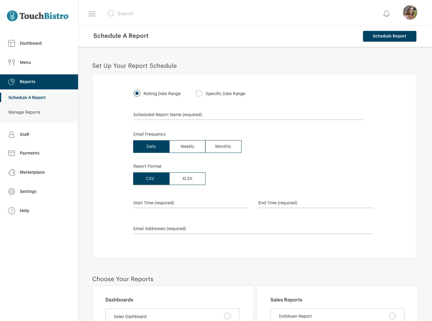
I created mockups for both concepts; in the first concept, I had initially placed the list of reports first on the page and the form was below. I still felt that seeing a list of fifty reports as soon as you load the page was overwhelming to the user, so I switched the two elements so that the form was above the list. I also ensured that as per our users’ feedback, that I was creating less complicated and more cohesive visually.

I felt strongly about finding a way to reduce the visual clutter, so I chose to explore some initial mockups of this concept for testing. I knew that the downside of the reduction in visual clutter would be that things were more hidden to users. I set out to understand which of these were most important to them, and which negatively affected their experience the most.

Testing the first concept: 15% increase in task completion accuracy.
Our team released the first concept to 50% of our customers alongside the original design as a control. I aimed to see a large reduction in task errors and I was successful in this; originally 25% of users repeatedly scheduled reports as one off emails and we reduced this to about 10%. Which means that this 10% are probably using scheduled reports in order to download reports in bulk, which is a feature we now considered adding. The 15% reduction was due to the UX previously being poor.
Testing the second concept: 10% more errors than the first concept.
Our team released the second concept to 50% of our customers alongside the original design as a control. I wanted to know if users had issues with their reports being hidden until the section is opened. By the end of this test about 20% of users seemed to not fully understand the interface and were forgetting where their reports were located. Because of this our team ended up selecting the first concept and releasing that to all of our customers due a lower error rate.
25%
We started out with only 25% of users scheduling reports as emails
10%
Were using the feature to bulk download reports
15%
Reduction in people misusing the feature
Due to the error rate when testin the second concept, my product manager and I decided to release the first concept. Over the next month, this is what we found:
Task success increased by about 70% due to a less confusing interface and presenting clear options to the user.
User happiness with the feature also increased, we had about 5% of users who made complaints about the interface in the survey we took, and many users who didn’t realize certain functionality existed now realized it did.
The feature is still being adopted at a steady increase, as it has been for the last 3 years.
User engagement still happens on a weekly or monthly basis (depending on the type of user), which is expected since this feature is scheduling an automtic task.
80% feature retention is now up from its original 50%
15% of support calls were about this feature, this was now reduced to about 5%.
Performing A/B tests was a great learning experience, and my PM and I really took it upon ourselves to make sure this happened despite a time crunch.
If I had more time I would have also liked to have done qualitative research in order to further understand user behaviours a little more deeply.